THE SHORT CASE STUDY
How a trust-first UX strategy, a friction-free cashback flow, and a conversion-focused onboarding reduced drop-off and drove 9 million downloads for P&G's La Cuponera.
Industry:
Brand-owned shopper marketing tool; FinTech
Scope:
Product design; Mobile-iOS & Android
Client:
Procter&Gamble
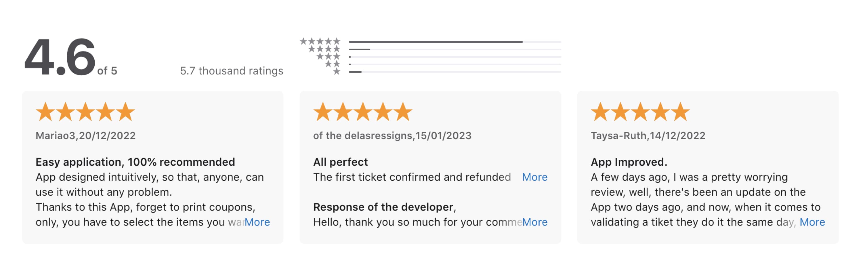
App Store rating
Out of 5, a direct signal of user satisfaction and trust in the experience.
Sign up rate
Of users who browsed offers completed signup
Uplift in sales
Less friction, more purchases. A direct connection from UX to revenue.
Procter & Gamble needed a mobile cashback application for their Spanish and Portuguese market. One that would stand out in a category already crowded with apps users had learned not to trust.
The brief wasn't just build a cashback app. It was: build one that people actually use more than once.
I joined as an independent Product Designer from day one, working from concept through to launched product. That meant owning the full process: research, information architecture, UX writing, visual design, and close collaboration with developers through build.
*All screens in this case study have been translated to English from the original Spanish.
The Problem
Retention had always been the achilles heel of cashback apps as a category. Users download them, hit one confusing moment, and leave. Research interviews with 30 existing cashback app users surfaced four recurring themes: complex redemption flows, lack of transparency about when cashback would arrive, irrelevant offers, and low trust in both payouts and data privacy.
The root cause across all four: existing apps made users work too hard for too little.
What I did
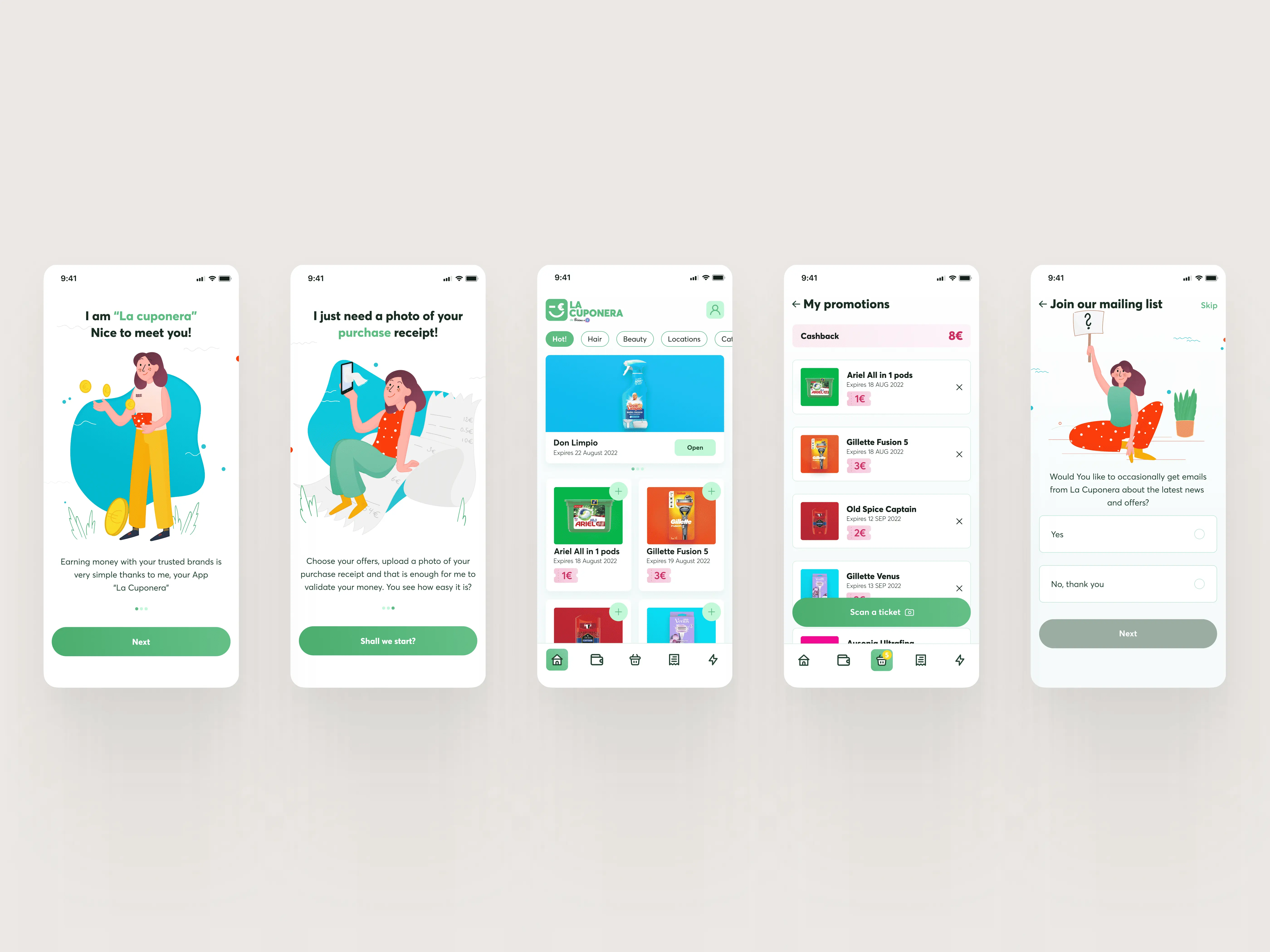
Built the product from scratch, esearch, information architecture, UX writing, visual design, and developer collaboration through build. The core strategic decision was to flip the standard onboarding sequence: show value first, ask for an account second. Most cashback apps front-load a registration wall before users have any reason to care.
Beyond onboarding, every feature was designed around the same trust principle, a cashback flow reduced to three steps, four clearly differentiated receipt statuses to eliminate post-scan anxiety, a wallet with a visible progress indicator toward the withdrawal threshold, and notifications tied to opt-in preferences rather than volume.
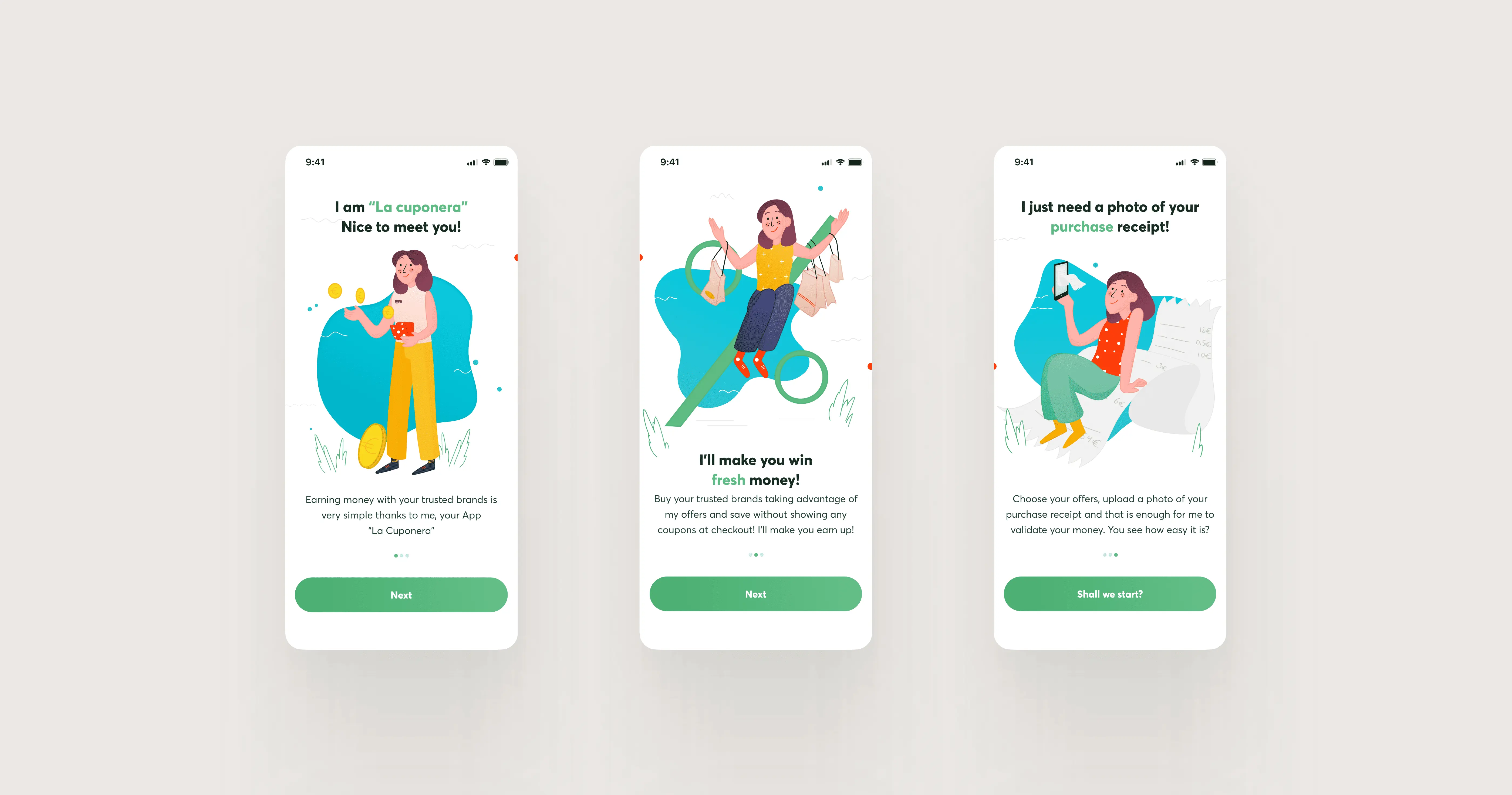
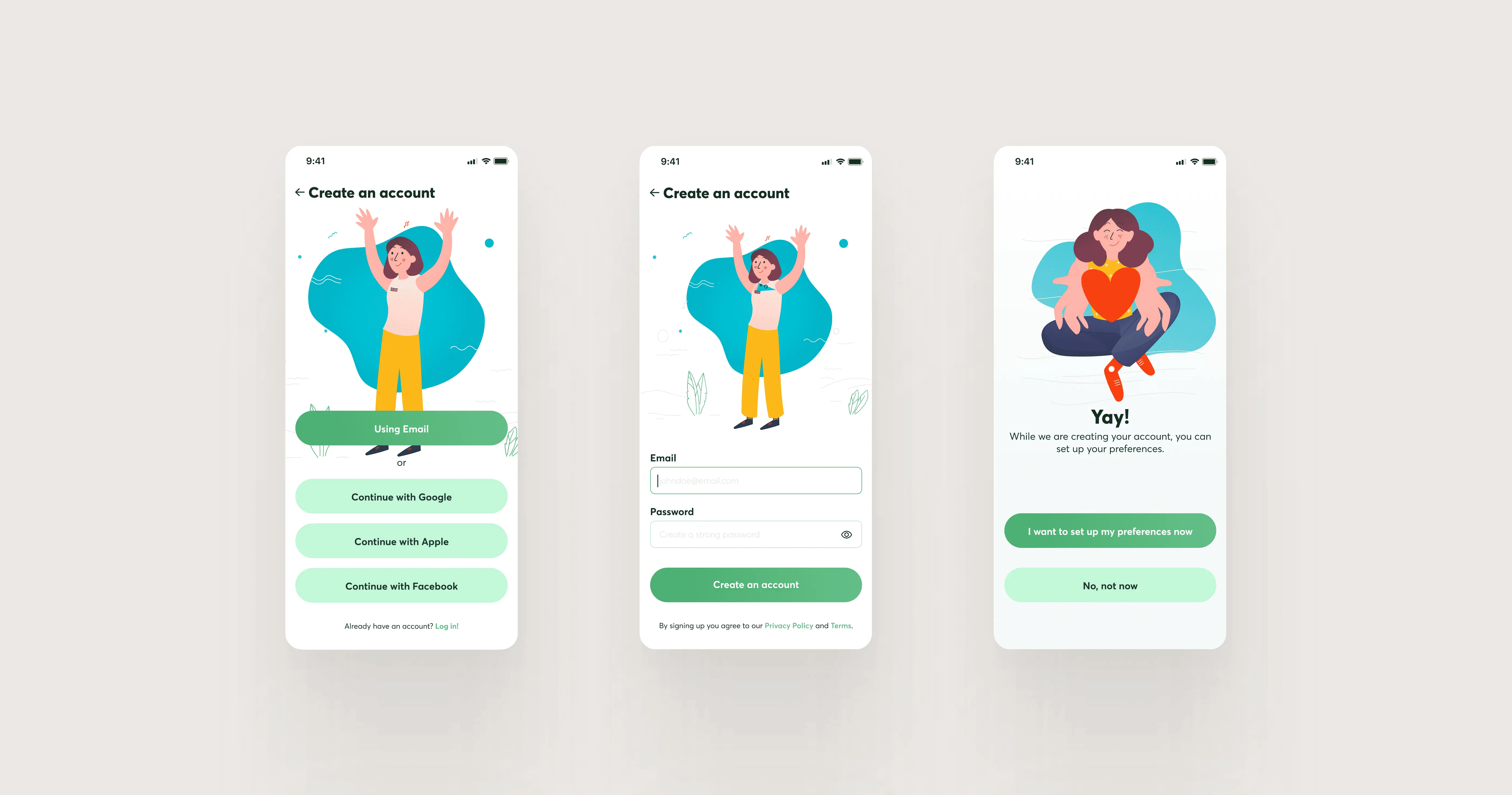


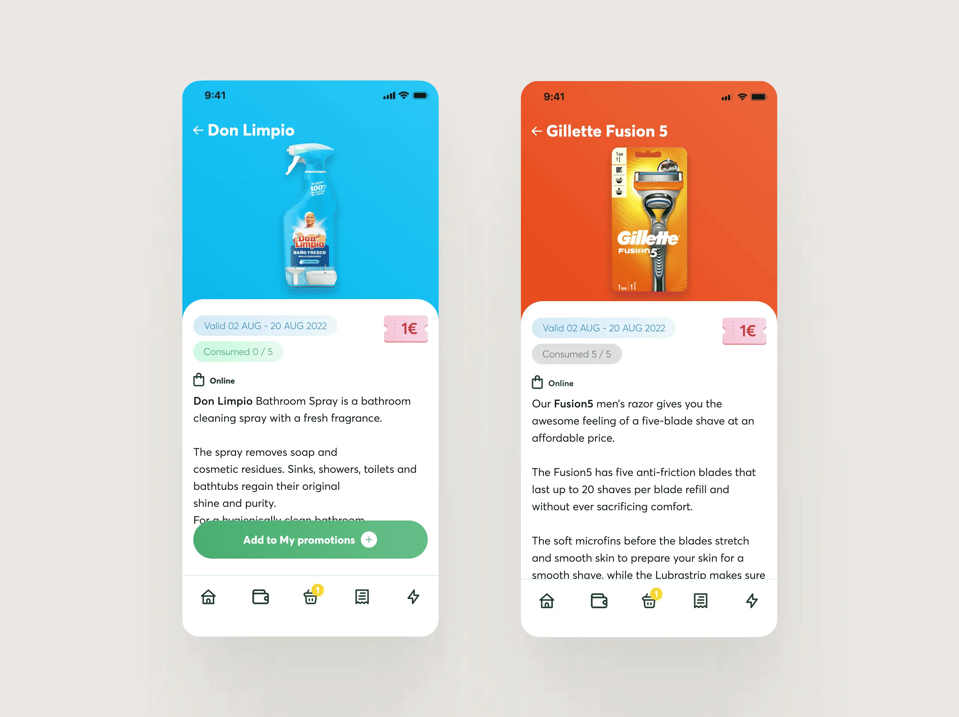

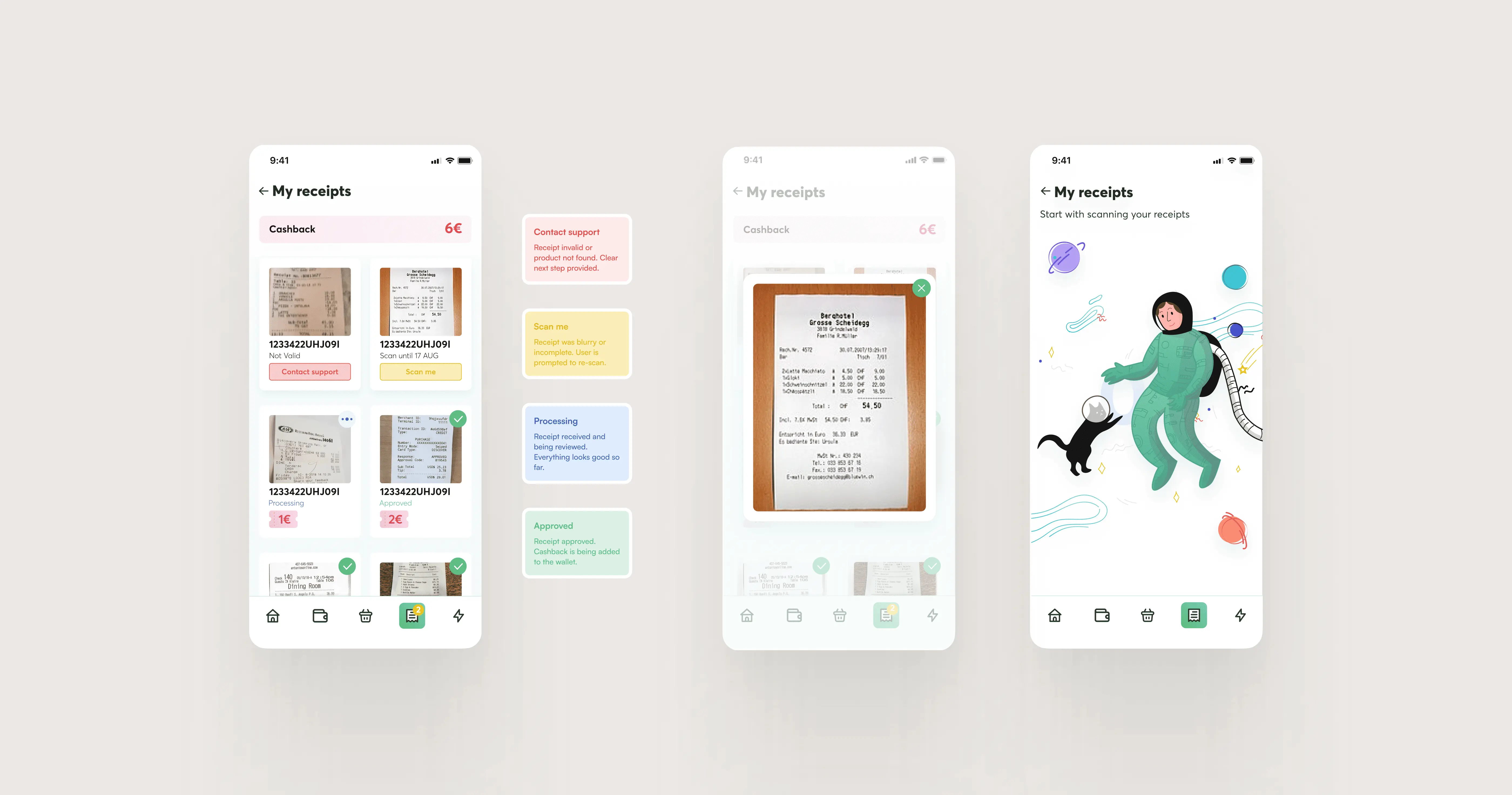

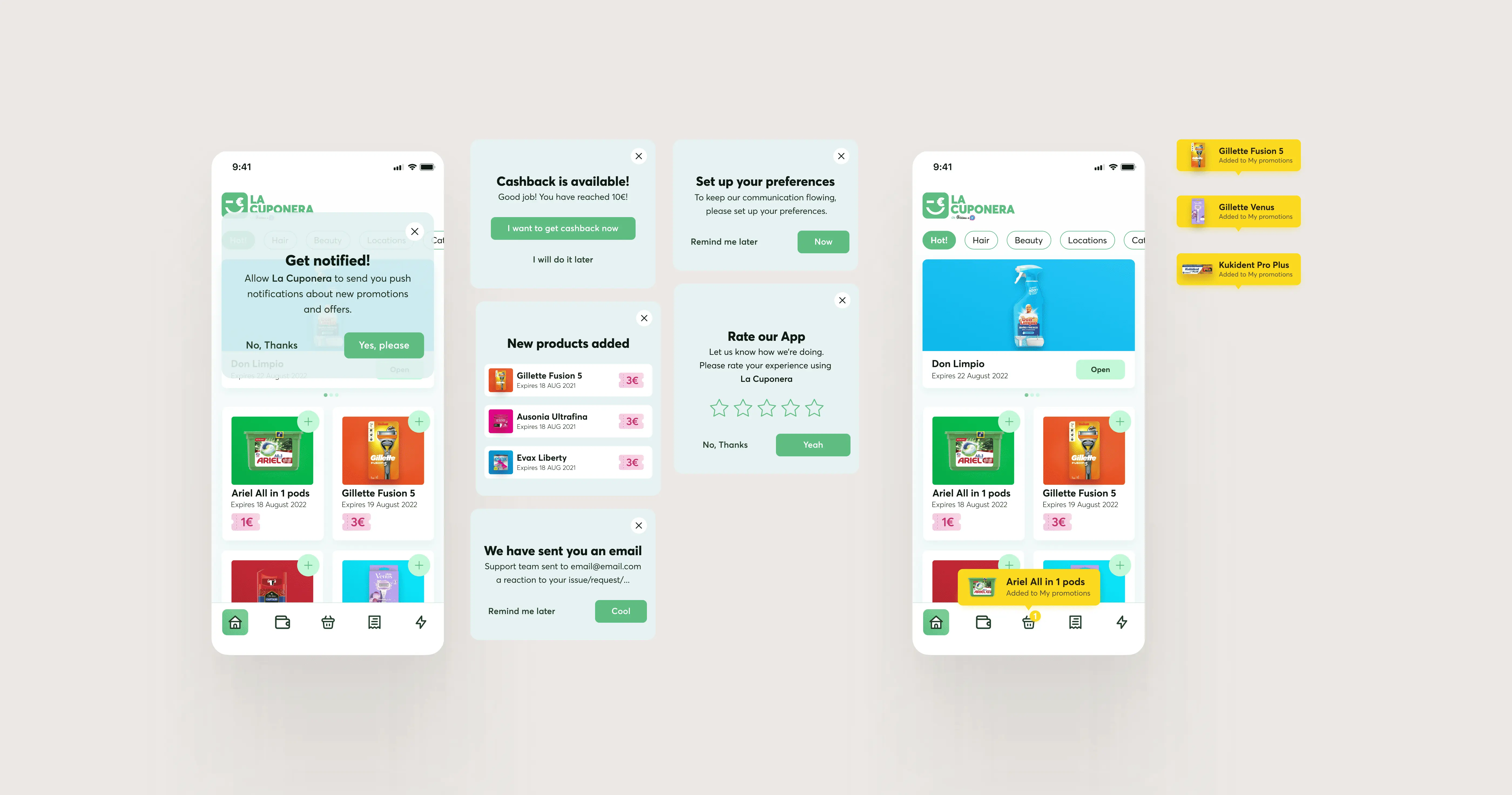
Trust isn't a feature, it's the architecture. Every drop-off point in a cashback app is a trust failure in disguise: unclear status, unexpected friction, ambiguous next step. Designing for clarity at each of those moments wasn't a UX decision, it was a retention decision.
VALIDATION
9+ million downloads and a 4.6★ rating don't lie
App Store/Google Play reviews are one of the clearest signals of whether a product's UX is working. A 4.6★ average across millions of downloads suggests the trust-first design strategy landed, users found the experience clear enough, reliable enough, and valuable enough to come back and tell others.