THE SHORT CASE STUDY
The data said thousands were clicking. The real number was a fraction of that.
The data said thousands were clicking. The real number was a fraction of that.
The data said thousands were clicking. The real number was a fraction of that.
A full CRO audit and mobile-first homepage redesign for a Dutch SaaS subscription platform, where the majority of users are on mobile and a misrouted CTA was hiding the true scale of the conversion problem.
A full CRO audit and mobile-first homepage redesign for a Dutch SaaS subscription platform, where the majority of users are on mobile and a misrouted CTA was hiding the true scale of the conversion problem.
-audit methodology, design process, and what I learned.
-audit methodology, design process, and what I learned.
-audit methodology, design process, and what I learned.
Industry:
PropTech
Scope:
CRO Audit + Mobile homepage redesign, UX copy
Client:
Confidential 🔒
🔒
This case study is presented under NDA. Specific analytics figures and client name have been removed. The methodology, process, and strategic thinking remain.
This case study is presented under NDA. Specific analytics figures and client name have been removed. The methodology, process, and strategic thinking remain.

The Impact
The Impact
The Impact
Due to NDA restrictions, specific conversion figures cannot be shared publicly. The audit identified and resolved the primary mechanical failure in the conversion funnel. Full metrics available on request in a confidential setting.
Due to NDA restrictions, specific conversion figures cannot be shared publicly. The audit identified and resolved the primary mechanical failure in the conversion funnel. Full metrics available on request in a confidential setting.
Context
Context
The client is a Dutch subscription platform that solves a genuinely painful problem: finding a room in the Netherlands means monitoring dozens of sources simultaneously, often missing listings within minutes. The platform automates that entirely, scanning 100+ sources and delivering matches directly to your inbox.
The product works. Reviews are strong. But the homepage wasn't converting at the rate the product deserved and the analytics data, once properly read, revealed exactly why.
The client is a Dutch subscription platform that solves a genuinely painful problem: finding a room in the Netherlands means monitoring dozens of sources simultaneously, often missing listings within minutes. The platform automates that entirely, scanning 100+ sources and delivering matches directly to your inbox.
The product works. Reviews are strong. But the homepage wasn't converting at the rate the product deserved and the analytics data, once properly read, revealed exactly why.
The Problem
The core problem
The Problem
The primary CTA appeared to be performing well. It wasn't. "Start now" didn't communicate what would happen next and when users tapped it, they landed on an inline city selector widget embedded on the homepage. That wasn't what they expected. The confusion caused a significant drop-off right at the moment of highest intent, and it was invisible in top-level analytics until the data was properly interrogated.
This was the most critical finding, but not the only one. Scroll depth data showed the vast majority of visitors were leaving without scrolling past the first section. Pricing, social proof, and the "How it works" explanation were effectively invisible to almost everyone who landed on the page.
Four things were killing conversion: an unclear value proposition, a visual design below standard, that didn't reflect a premium product, a weak mobile experience (for a product whose goal was app downloads), and an information architecture that forced users to ask the chatbot for basic answers.
In fintech, trust is a prerequisite for conversion. The site wasn't earning it.
The primary CTA appeared to be performing well. It wasn't. "Start now" didn't communicate what would happen next and when users tapped it, they landed on an inline city selector widget embedded on the homepage. That wasn't what they expected. The confusion caused a significant drop-off right at the moment of highest intent, and it was invisible in top-level analytics until the data was properly interrogated.
This was the most critical finding, but not the only one. Scroll depth data showed the vast majority of visitors were leaving without scrolling past the first section. Pricing, social proof, and the "How it works" explanation were effectively invisible to almost everyone who landed on the page.
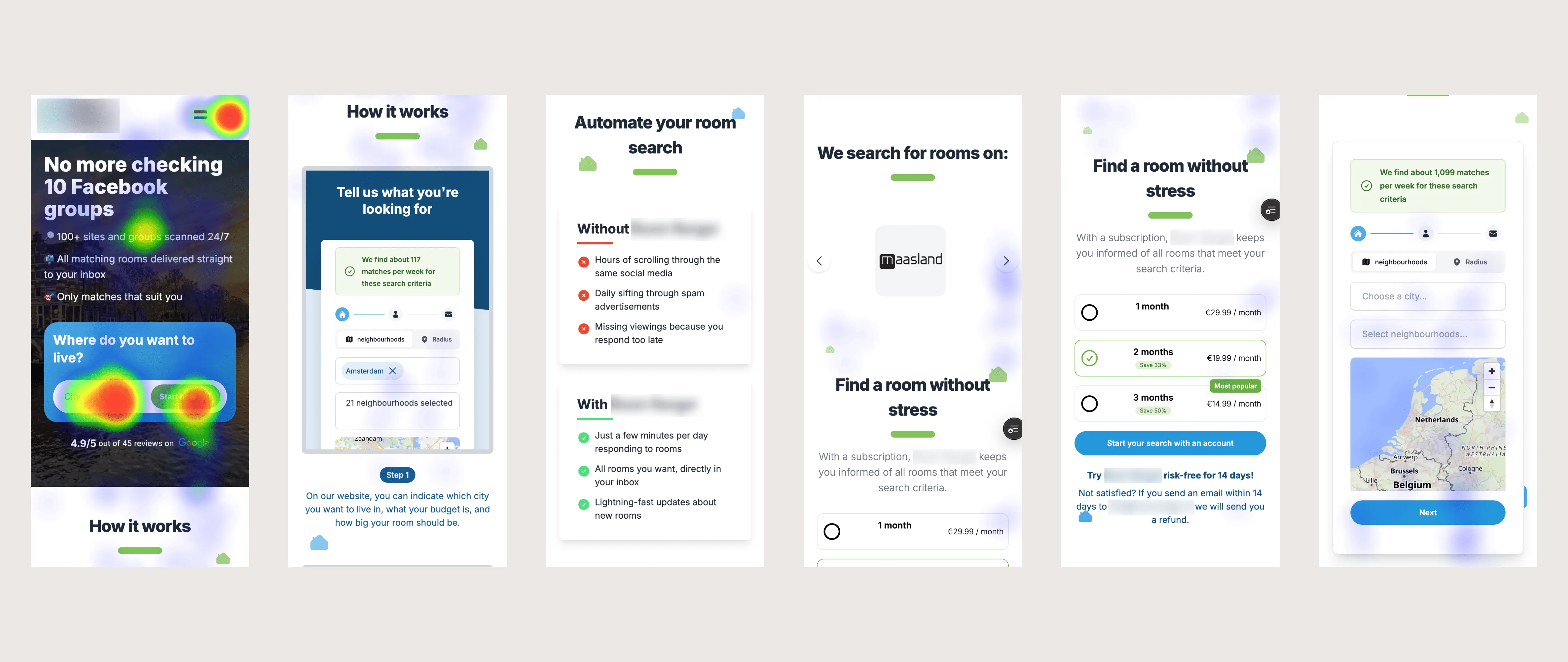
Heatmap: tap concentration reveals where user attention and intent are actually landing on the original homepage
Heatmap: tap concentration reveals where user attention and intent are actually landing on the original homepage
What I Did
What I did
What I Did
Conducted a full CRO and UX audit across six structured dimensions (first impression, funnel friction, trust barriers, value communication, UX heuristics, and analytics), delivered as a 9-page report with findings rated by business impact.
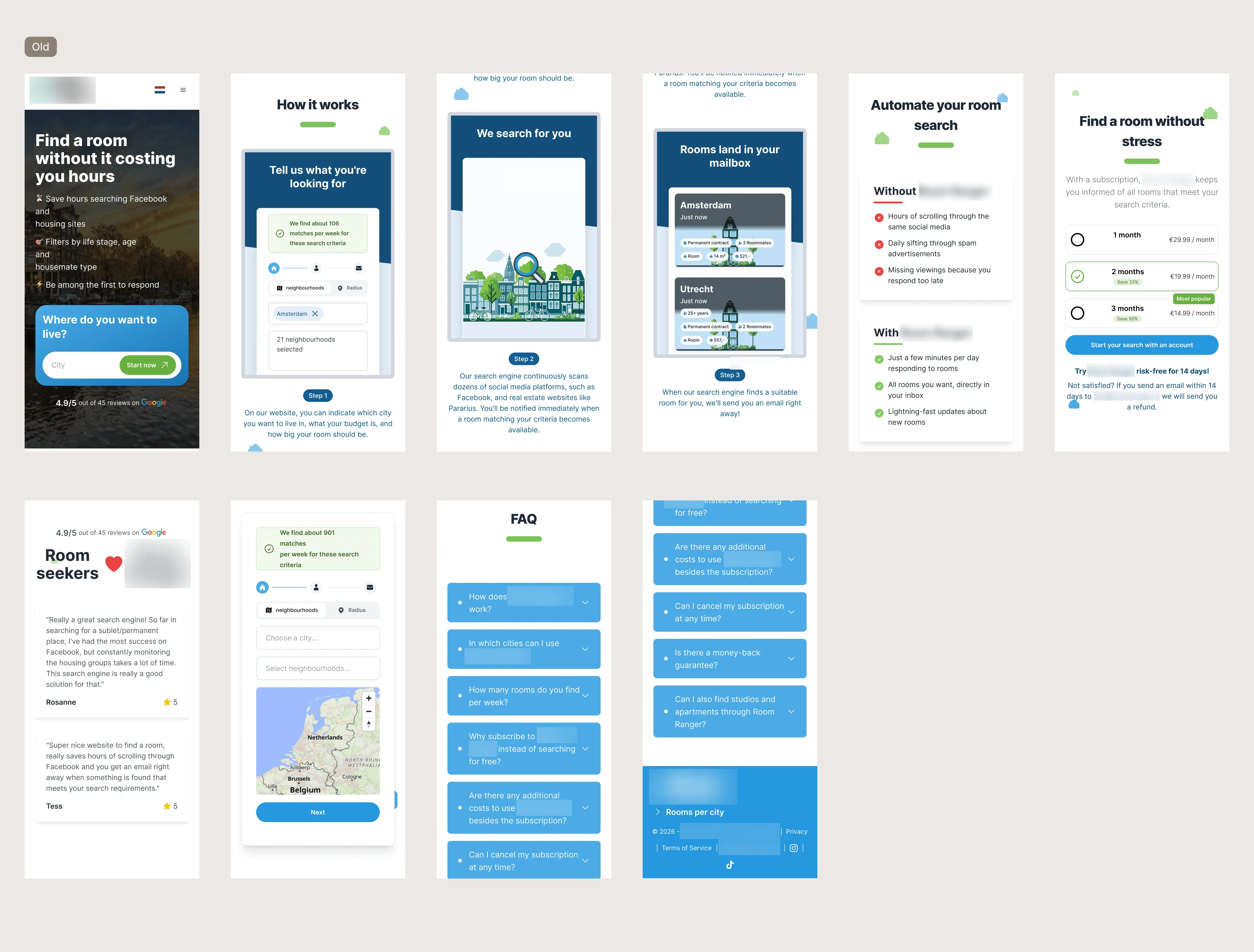
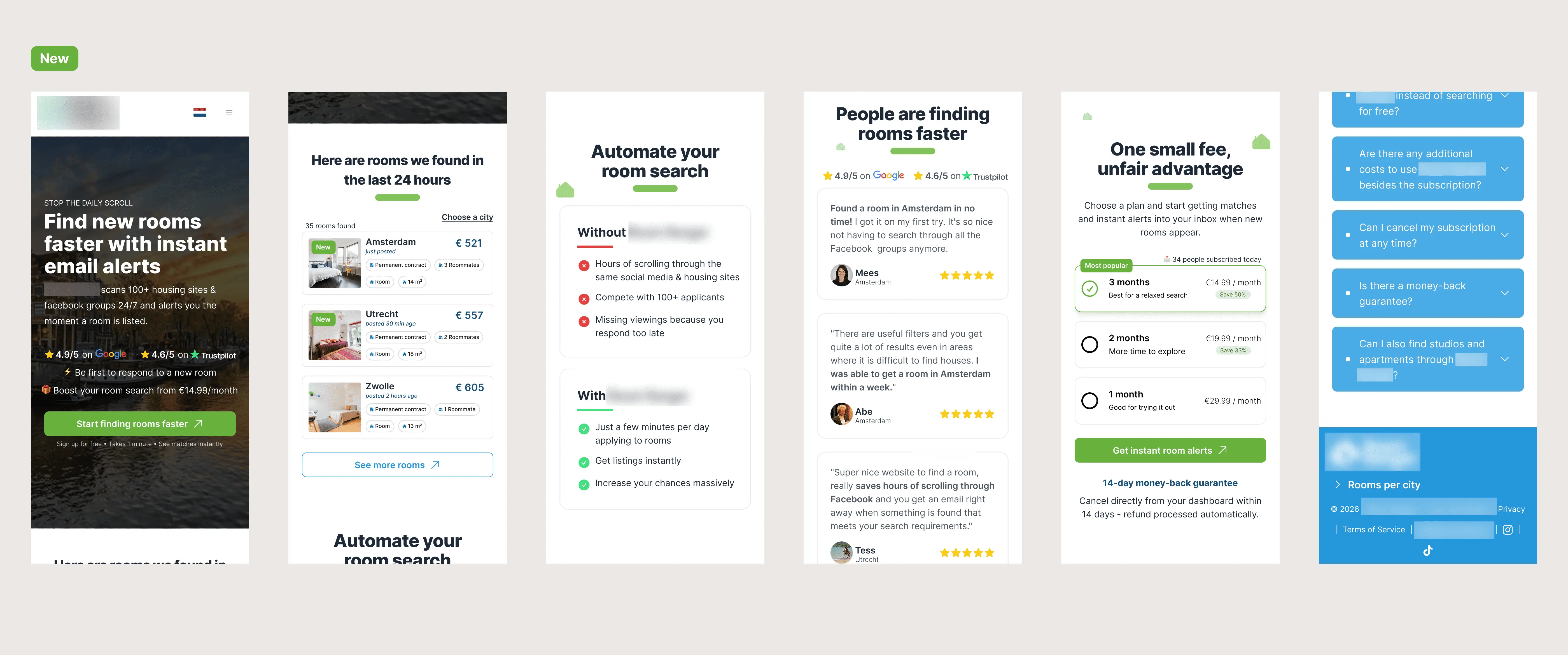
The homepage redesign was built around one reality: this is a mobile product. Every element, CTA placement, tap targets, information hierarchy, scroll depth of key content was designed for a phone held in one hand by someone who has been searching for a room for weeks. The redesign flipped the conversion sequence: value first, commitment second, paywall last.
Conducted a full CRO and UX audit across six structured dimensions (first impression, funnel friction, trust barriers, value communication, UX heuristics, and analytics), delivered as a 9-page report with findings rated by business impact.
The homepage redesign was built around one reality: this is a mobile product. Every element, CTA placement, tap targets, information hierarchy, scroll depth of key content was designed for a phone held in one hand by someone who has been searching for a room for weeks. The redesign flipped the conversion sequence: value first, commitment second, paywall last.
Conducted a full CRO and UX audit across six structured dimensions (first impression, funnel friction, trust barriers, value communication, UX heuristics, and analytics), delivered as a 9-page report with findings rated by business impact.
The homepage redesign was built around one reality: this is a mobile product. Every element, CTA placement, tap targets, information hierarchy, scroll depth of key content was designed for a phone held in one hand by someone who has been searching for a room for weeks. The redesign flipped the conversion sequence: value first, commitment second, paywall last.
The Insight
The Insight
The product was asking users to commit before giving them a reason to. A healthy looking metric was masking a broken funnel. Both problems had the same fix: stop optimising the surface, interrogate the data underneath it.
The product was asking users to commit before giving them a reason to. A healthy looking metric was masking a broken funnel. Both problems had the same fix: stop optimising the surface, interrogate the data underneath it.
LET'S WORK TOGETHER
The biggest conversion problem on this site was invisible in the top-level analytics. Yours might be too!
The biggest conversion problem on this site was invisible in the top-level analytics. Yours might be too!
Most analytics dashboards show you what happened. A CRO audit shows you why and what to do about it
Most analytics dashboards show you what happened. A CRO audit shows you why and what to do about it
LET'S WORK TOGETHER