THE FULL CASE STUDY

TL;DR The data said thousands were clicking. The real number was a fraction of that.

TL;DR The data said thousands were clicking. The real number was a fraction of that.

TL;DR The data said thousands were clicking. The real number was a fraction of that.

A full CRO audit and mobile-first homepage redesign for a Dutch SaaS subscription platform, where the majority of users are on mobile and a misrouted CTA was hiding the true scale of the conversion problem.

A full CRO audit and mobile-first homepage redesign for a Dutch SaaS subscription platform, where the majority of users are on mobile and a misrouted CTA was hiding the true scale of the conversion problem.

A full CRO audit and mobile-first homepage redesign for a Dutch SaaS subscription platform, where the majority of users are on mobile and a misrouted CTA was hiding the true scale of the conversion problem.

Industry:

PropTech

Scope:

CRO Audit + Mobile homepage redesign, UX copy

Client:

Confidential

🔒

This case study is presented under NDA. Specific analytics figures and client name have been removed. The methodology, process, and strategic thinking remain.

This case study is presented under NDA. Specific analytics figures and client name have been removed. The methodology, process, and strategic thinking remain.

CRO & UX audit, CRO driven redesign
CONTEXT

A product solving a real problem with a homepage that wasn't converting

A product solving a real problem with a homepage that wasn't converting

A product solving a real problem with a homepage that wasn't converting

The client is a Dutch subscription platform that solves a genuinely painful problem: finding a room in the Netherlands means monitoring dozens of Facebook groups, Pararius, and housing platforms simultaneously, often missing listings within minutes.
The platform automates that entirely, scanning 100+ sources continuously and delivering matching rooms directly to your inbox.

The product works. Users find rooms. Reviews are strong. But the homepage wasn't converting visitors into subscribers at the rate the product deserved, and the analytics data, once properly read, revealed exactly why.

I was brought in to conduct a full CRO and UX audit across six structured dimensions, identify the friction points, and redesign the homepage with a mobile-first, value-first conversion strategy.


The brief was clear: increase sign-ups and registrations. Everything in the audit was evaluated against that single conversion goal.

The client is a Dutch subscription platform that solves a genuinely painful problem: finding a room in the Netherlands means monitoring dozens of Facebook groups, Pararius, and housing platforms simultaneously, often missing listings within minutes.


The platform automates that entirely, scanning 100+ sources continuously and delivering matching rooms directly to your inbox.

The product works. Users find rooms. Reviews are strong. But the homepage wasn't converting visitors into subscribers at the rate the product deserved, and the analytics data, once properly read, revealed exactly why.

I was brought in to conduct a full CRO and UX audit across six structured dimensions, identify the friction points, and redesign the homepage with a mobile-first, value-first conversion strategy.

The brief was clear: increase sign-ups and registrations. Everything in the audit was evaluated against that single conversion goal.

The client is a Dutch subscription platform that solves a genuinely painful problem: finding a room in the Netherlands means monitoring dozens of Facebook groups, Pararius, and housing platforms simultaneously, often missing listings within minutes.
The platform automates that entirely, scanning 100+ sources continuously and delivering matching rooms directly to your inbox.


The product works. Users find rooms. Reviews are strong. But the homepage wasn't converting visitors into subscribers at the rate the product deserved, and the analytics data, once properly read, revealed exactly why.


I was brought in to conduct a full CRO and UX audit across six structured dimensions, identify the friction points, and redesign the homepage with a mobile-first, value-first conversion strategy.


The brief was clear: increase sign-ups and registrations. Everything in the audit was evaluated against that single conversion goal.

Misrouted CTA

CRITICAL FINDING

The CTA looked like it was converting, but it wasn't going anywhere useful.

The CTA looked like it was converting, but it wasn't going anywhere useful.

The CTA looked like it was converting, but it wasn't going anywhere useful.

The most important finding in the audit wasn't a UX problem, it was a data problem hiding a UX problem. The primary CTA was being counted as a conversion event while routing users to an inline widget rather than the registration page. The gap between reported clicks and actual registration page visits was dramatic.

The most important finding in the audit wasn't a UX problem, it was a data problem hiding a UX problem. The primary CTA was being counted as a conversion event while routing users to an inline widget rather than the registration page. The gap between reported clicks and actual registration page visits was dramatic.

What was happening

What was happening

PostHog analytics reported a large number of CTA clicks, a figure that looked healthy in isolation. But cross-referencing with registration page data told a completely different story. The vast majority of those clicks were landing users on a city selector widget embedded on the homepage itself, not navigating them to the registration flow.

Visitors were tapping "Start now" expecting to go somewhere. Instead they got an inline room picker on mobile, got confused or disinterested, and left. This was the biggest mechanical failure in the entire funnel, and it was invisible in the top-level analytics until the data was interrogated properly.

PostHog analytics reported a large number of CTA clicks, a figure that looked healthy in isolation. But cross-referencing with registration page data told a completely different story. The vast majority of those clicks were landing users on a city selector widget embedded on the homepage itself, not navigating them to the registration flow.

Visitors were tapping "Start now" expecting to go somewhere. Instead they got an inline room picker on mobile, got confused or disinterested, and left. This was the biggest mechanical failure in the entire funnel, and it was invisible in the top-level analytics until the data was interrogated properly.

Original funnel, CRO & UX audit, CRO driven redesign

Original funnel

Original funnel

Original funnel

The registration form completion rate among users who actually reached it was strong. The bottleneck was entirely upstream: almost nobody was getting there because the CTA wasn't taking them there.

The registration form completion rate among users who actually reached it was strong. The bottleneck was entirely upstream: almost nobody was getting there because the CTA wasn't taking them there.

ANALYTICS

What more the analytics revealed

What more the analytics revealed

What more the analytics revealed

The misrouted CTA was the headline finding, but the analytics told a richer story about where and how the homepage was losing visitors. The platform's audience is overwhelmingly mobile, a critical constraint that shaped every design recommendation that followed.

Scroll depth data was particularly revealing.


The vast majority of visitors were leaving without scrolling past the first section of the page, meaning pricing, social proof, testimonials, and the "How it works" explanation were effectively invisible to almost everyone who landed on the homepage.

The misrouted CTA was the headline finding, but the analytics told a richer story about where and how the homepage was losing visitors. The platform's audience is overwhelmingly mobile, a critical constraint that shaped every design recommendation that followed.

Scroll depth data was particularly revealing. The vast majority of visitors were leaving without scrolling past the first section of the page, meaning pricing, social proof, testimonials, and the "How it works" explanation were effectively invisible to almost everyone who landed on the homepage.

The misrouted CTA was the headline finding, but the analytics told a richer story about where and how the homepage was losing visitors. The platform's audience is overwhelmingly mobile, a critical constraint that shaped every design recommendation that followed.


Scroll depth data was particularly revealing. The vast majority of visitors were leaving without scrolling past the first section of the page, meaning pricing, social proof, testimonials, and the "How it works" explanation were effectively invisible to almost everyone who landed on the homepage.

Key signals from the data

Key signals from the data

  • Overwhelming majority of visitors are on mobile, the site is effectively a mobile product

  • Median homepage session is very short, most users see the hero and leave

  • Pricing section scroll depth is critically low, the most important conversion element is invisible to nearly all visitors

  • Registration page completion rate is strong for those who reach it, the form works, the funnel is the problem

  • Month 1 refund rate signals possible expectation mismatch at signup
Heatmap, CRO & UX audit, CRO driven redesign

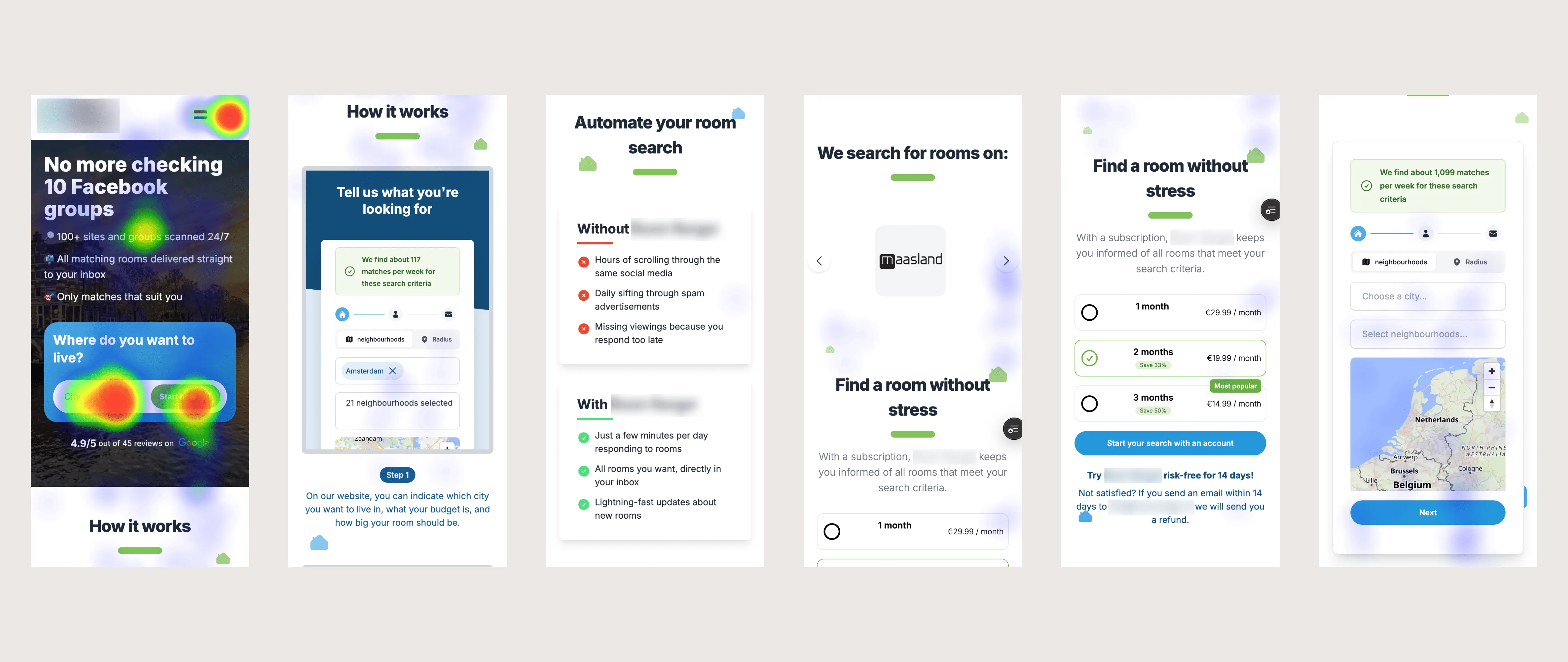
Heatmap: tap concentration reveals where user attention and intent are actually landing on the original homepage

Heatmap: tap concentration reveals where user attention and intent are actually landing on the original homepage

Heatmap: tap concentration reveals where user attention and intent are actually landing on the original homepage

6 dimension framework

UX & CRO AUDIT

A structured audit across six conversions

A structured audit across six conversions

A structured audit across six conversions

The full audit was delivered as a 9-page PDF report covering six structured dimensions: first impression and clarity, funnel friction, trust and conversion barriers, value communication and positioning, UX and CRO heuristics, and analytics. Each finding was rated High, Medium, or Quick win by business impact.

Due to the NDA, the full report cannot be shared publicly, but a selection of findings is shown below to illustrate the audit methodology and depth of analysis.

The full audit was delivered as a 9-page PDF report covering six structured dimensions: first impression and clarity, funnel friction, trust and conversion barriers, value communication and positioning, UX and CRO heuristics, and analytics. Each finding was rated High, Medium, or Quick win by business impact.

Due to the NDA, the full report cannot be shared publicly, but a selection of findings is shown below to illustrate the audit methodology and depth of analysis.

The audit covered six dimensions: first impression and clarity, funnel friction, trust and conversion barriers, value communication and positioning, UX and CRO heuristics, and analytics. Each finding was rated High, Medium, or Quick win by business impact.

Audit example, CRO & UX audit, CRO driven redesign

Note: Specific analytics figures are omitted under NDA. The findings above are described directionally. The full data and precise metrics were shared with the client in the audit report.

Note: Specific analytics figures are omitted under NDA. The findings above are described directionally. The full data and precise metrics were shared with the client in the audit report.

Note: Specific analytics figures are omitted under NDA. The findings above are described directionally. The full data and precise metrics were shared with the client in the audit report.

Value first

DESIGN & STRATEGY

Show value first, ask for money later

Show value first, ask for money later

Every finding in the audit pointed to the same root cause: the product was asking users to commit before giving them a reason to. The redesign flipped that sequence entirely, value first, commitment second, paywall last.

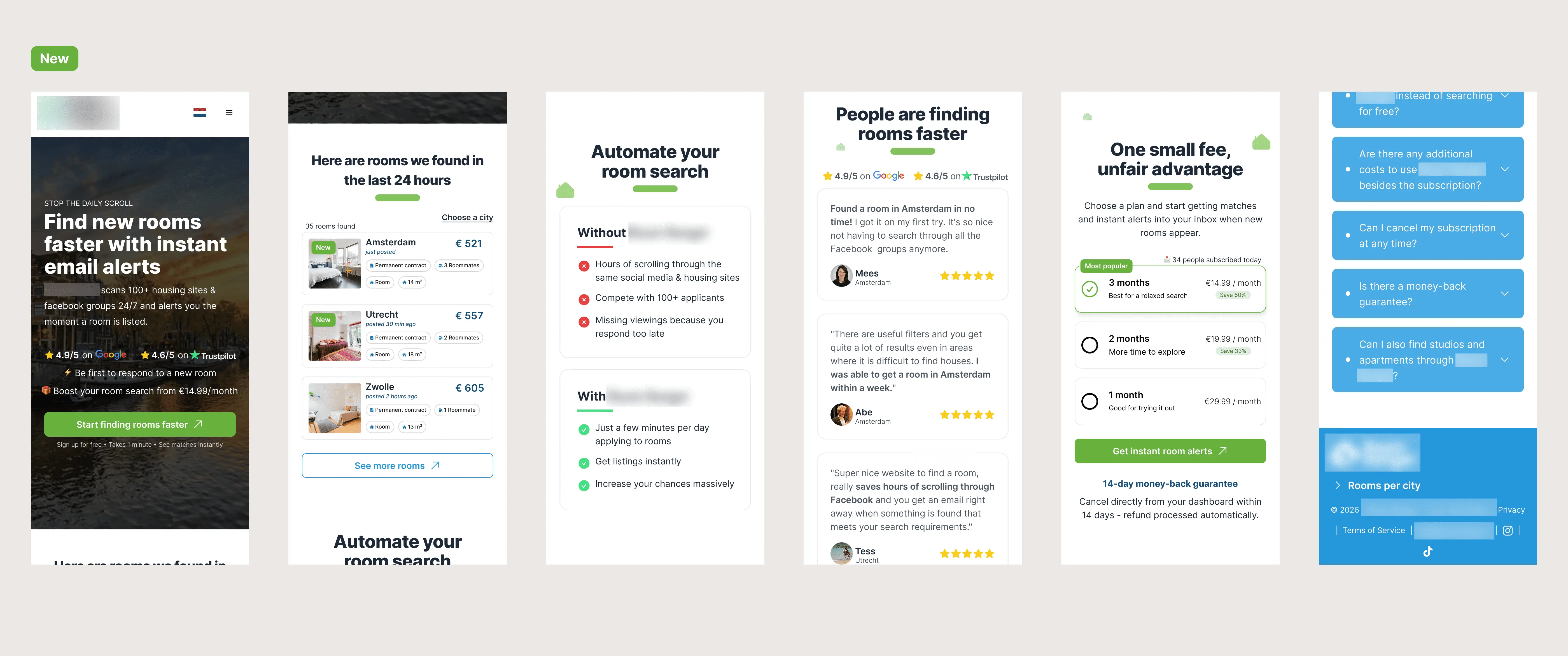
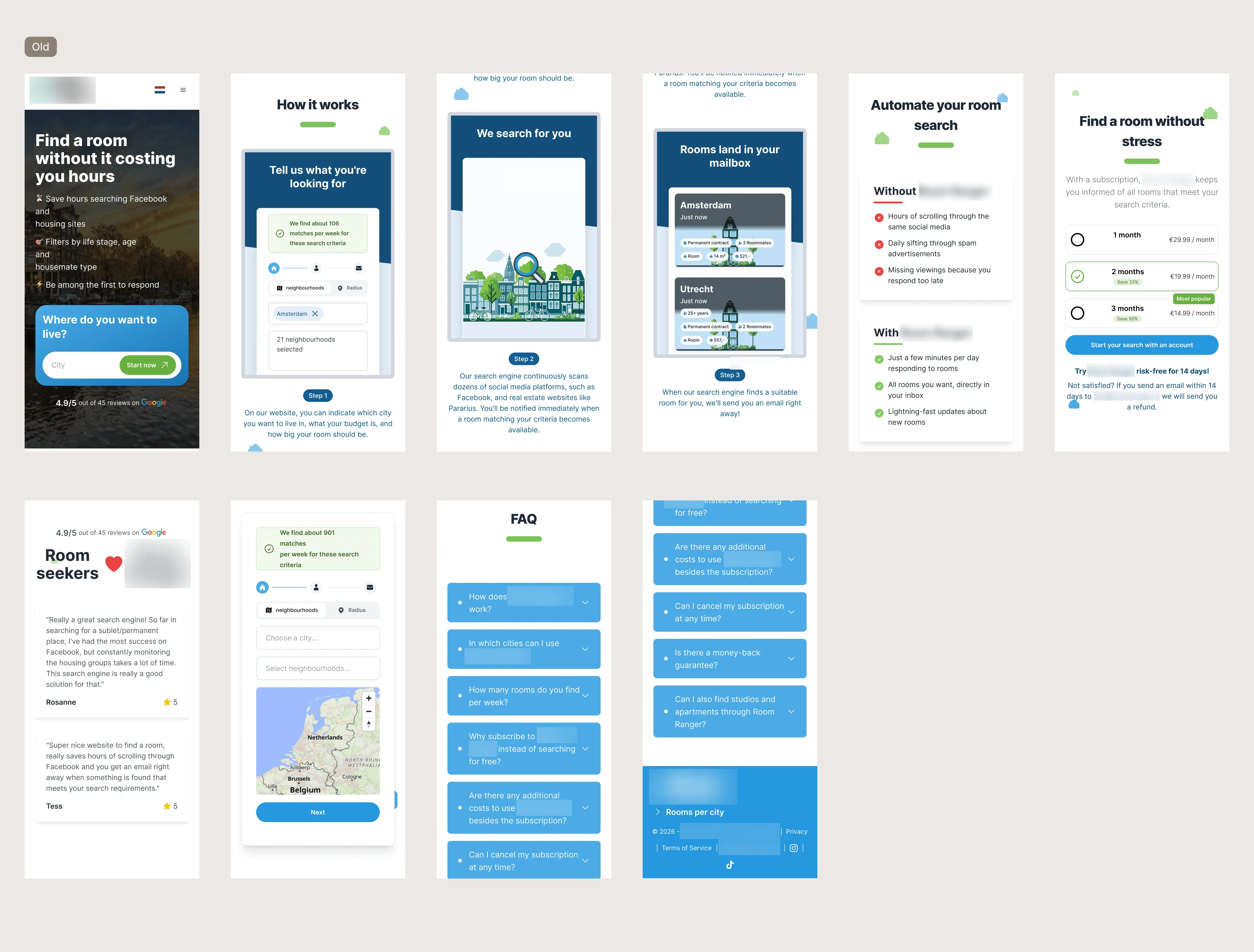
The redesigned homepage was built around the mobile-first reality.


Every element, tap target size, CTA placement, information hierarchy, scroll depth of key content, was designed for a phone held in one hand by someone who has been searching for a room for weeks and has very little patience left. The above-fold section now leads with the value proposition, surfaces trust signals, and presents a single clear CTA that routes directly to registration.

Every finding in the audit pointed to the same root cause: the product was asking users to commit before giving them a reason to. The redesign flipped that sequence entirely, value first, commitment second, paywall last.

The redesigned homepage was built around the mobile-first reality. Every element, tap target size, CTA placement, information hierarchy, scroll depth of key content, was designed for a phone held in one hand by someone who has been searching for a room for weeks and has very little patience left. The above-fold section now leads with the value proposition, surfaces trust signals, and presents a single clear CTA that routes directly to registration.

Every finding in the audit pointed to the same root cause: the product was asking users to commit before giving them a reason to. The redesign flipped that sequence entirely, value first, commitment second, paywall last.


The redesigned homepage was built around the mobile-first reality. Every element, tap target size, CTA placement, information hierarchy, scroll depth of key content, was designed for a phone held in one hand by someone who has been searching for a room for weeks and has very little patience left. The above-fold section now leads with the value proposition, surfaces trust signals, and presents a single clear CTA that routes directly to registration.

Key CRO changes

Key CRO changes

  • Pricing anchored above the fold, removes the need to hunt for cost information

  • Trust signals moved above the fold, review ratings visible immediately

  • Value-first flow, users see real (blurred) rooms before signup is requested

  • Mobile tap targets and thumb-zone CTA placement throughout

  • Clearer expectation-setting to address the month-1 refund rate
Old, CRO & UX audit, CRO driven redesign
Redesign, CRO & UX audit, CRO driven redesign

Key takeaways from a data-driven UX & CRO audit

Key takeaways from a data-driven UX & CRO audit

A healthy-looking metric can hide a broken funnel

A large CTA click count looked like strong performance. It was actually a false signal masking the fact that almost nobody was reaching registration. Always trace the click to its destination, the number on the dashboard is only as useful as the action it represents.

A large CTA click count looked like strong performance. It was actually a false signal masking the fact that almost nobody was reaching registration. Always trace the click to its destination, the number on the dashboard is only as useful as the action it represents.

Mobile-majority isn't a detail, it is the design brief

When the overwhelming majority of users are on mobile, designing for desktop first isn't a compromise, it's a structural mistake. Device split should be the first thing checked before any design decision is made.

When the overwhelming majority of users are on mobile, designing for desktop first isn't a compromise, it's a structural mistake. Device split should be the first thing checked before any design decision is made.

Show value before asking for commitment

Asking users to pay before they've seen a single room that matches their needs creates a trust barrier the product's quality alone can't overcome. The "unlock these rooms" mechanic, real listings, blurred details gives users a reason to believe before they're asked to commit.

Asking users to pay before they've seen a single room that matches their needs creates a trust barrier the product's quality alone can't overcome. The "unlock these rooms" mechanic, real listings, blurred details gives users a reason to believe before they're asked to commit.

Refund rate is a UX metric, not just a business one

A high month-1 refund rate signals the homepage is setting wrong expectations. Conversion optimisation isn't just about getting more signups, it's about getting the right signups who stay.

A high month-1 refund rate signals the homepage is setting wrong expectations. Conversion optimisation isn't just about getting more signups, it's about getting the right signups who stay.

LET'S WORK TOGETHER

The biggest conversion problem on this site was invisible in the top-level analytics. Yours might be too!

The biggest conversion problem on this site was invisible in the top-level analytics. Yours might be too!

Most analytics dashboards show you what happened. A CRO audit shows you why and what to do about it

Most analytics dashboards show you what happened. A CRO audit shows you why and what to do about it

LET'S WORK TOGETHER

The biggest conversion problem on this site was invisible in the top-level analytics. Yours might be too!

Most analytics dashboards show you what happened. A CRO audit shows you why and what to do about it