THE FULL CASE STUDY

TL;DR A website redesign for a Swiss investment app that deserved better

TL;DR A website redesign for a Swiss investment app that deserved better

TL;DR A website redesign for a Swiss investment app that deserved better

How a CRO-driven redesign of arvy's website turned an unclear value proposition into a conversion-focused experience built to drive app downloads and newsletter signups for a Swiss fintech startup.

How a CRO-driven redesign of arvy's website turned an unclear value proposition into a conversion-focused experience built to drive app downloads and newsletter signups for a Swiss fintech startup.

Industry:

FinTech

Scope:

Full website redesign B2C & B2B, CRO, Copywriting

Client:

arvy
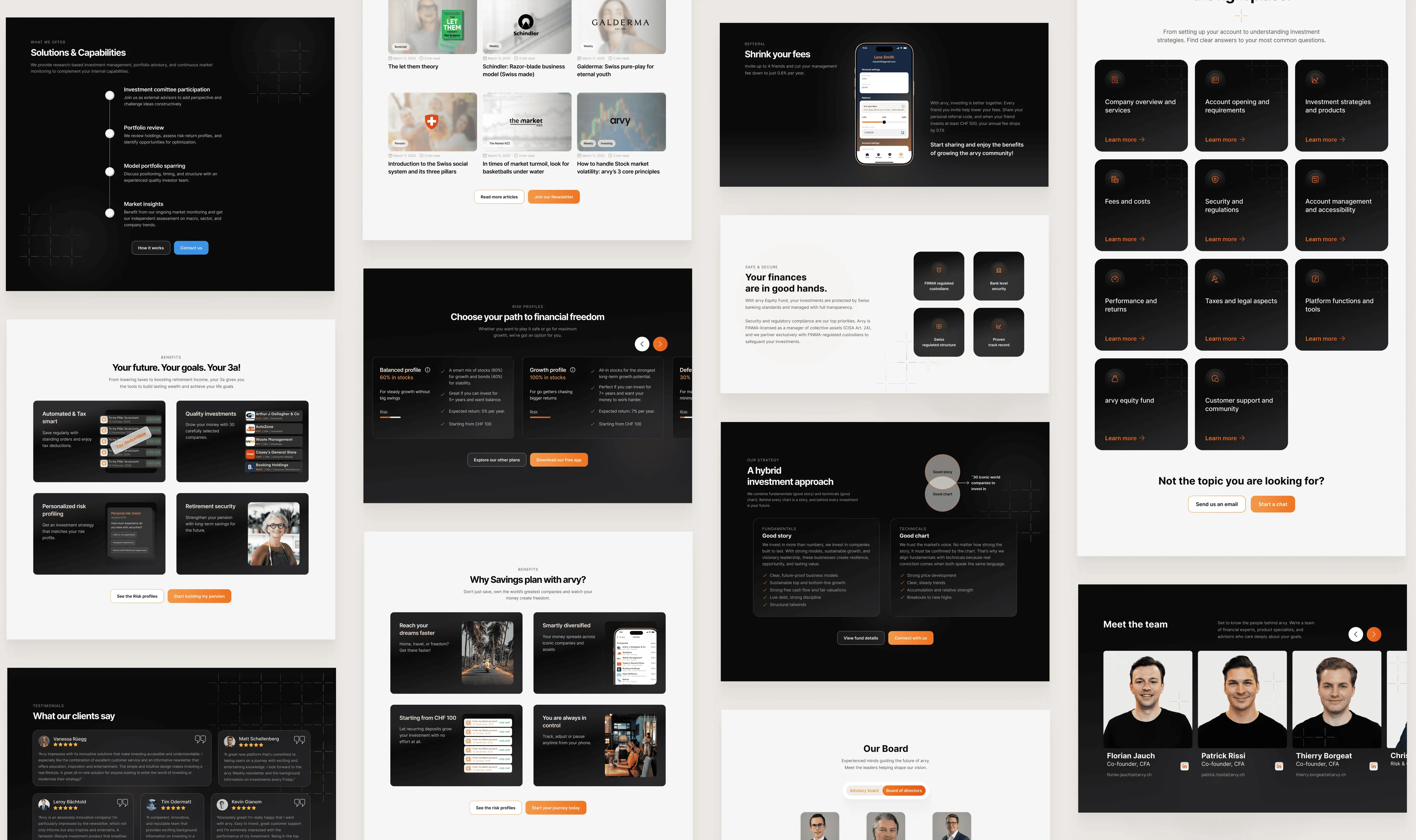
Website redesign for arvy, Cro design

Quick project overview

Quick project overview

The problem

The problem

arvy had a genuinely strong investment product but with a website that buried its value. Curious visitors arrived, failed to get the answers they needed to trust a regulated product with their money, and left before converting. In fintech, an unanswered question isn't friction, it's a trust failure, and trust is the whole funnel.

My role

My role

Solo designer and CRO lead across the full engagement: discovery and competitor research, persona definition, information architecture, conversion copywriting, and the end-to-end redesign of 19 responsive pages across both the B2C and B2B sides of the business. I also owned the handoff, working closely with the development team and overseeing implementation to make sure the build matched the design intent down to the detail.

Key decisions

Key decisions

  • Came up with the co-investment model, arvy's core differentiator, (founders invest in the same companies as they offer throught the application).

  • Treated the chatbot logs as a free UX audit and rebuilt the IA around the five recurring questions

  • Split B2C and B2B at the entry point rather than forcing one narrative to serve two very different buyers.

  • Came up with the co-investment model, arvy's core differentiator, (owners invest in the same stocks as they offer throught the application).

  • Treated the chatbot logs as a free UX audit and rebuilt the IA around the five recurring questions

  • Split B2C and B2B at the entry point rather than forcing one narrative to serve two very different buyers.


  • Ranked two conversion goals: app downloads/installs as primary, newsletter signup as the low-commitment path for visitors not yet ready to invest.


  • Locked the structure with wireframes before any visual layer, so the redesign solved the conversion problem, not just the looks.

  • Ranked two conversion goals: app downloads/installs as primary, newsletter signup as the low-commitment path for visitors not yet ready to invest.

  • Locked the structure with wireframes before any visual layer, so the redesign solved the conversion problem, not just the looks.

THE IMPACT

Measured results, 6 months post-launch

Measured results, 6 months post-launch

+55%

+55%

Active users

Growth in active users in the 6 months following launch of the redesigned site.

+167%

+167%

User engagement

Engagement growth in Switzerland, arvy's core market, more than doubling post-launch.

~1,7%

~1,7%

App install click rate

From cold traffic, a strong signal for a regulated fintech product where trust is a prerequisite.

1.075

1.075

Newsletter sign-ups

First conversion baseline established, the secondary CTA goal.

*For finance/fintech websites broadly, average website conversion rate sits between 2-4%. Source clevertap.com

*For finance/fintech websites broadly, average website conversion rate sits between 2-4%. Source clevertap.com

Analytics measurement is ongoing, the goal is to continue iterating based on real user behaviour as the data matures. One early finding has already surfaced: a bottleneck in the app's onboarding flow, pointing to the next area of focus for improving conversion end to end.

Analytics measurement is ongoing, the goal is to continue iterating based on real user behaviour as the data matures. One early finding has already surfaced: a bottleneck in the app's onboarding flow, pointing to the next area of focus for improving conversion end to end.

CONTEXT

A strong investment app, held back by a website that couldn't tell its story

A strong investment app, held back by a website that couldn't tell its story

arvy is a Swiss investment platform with a genuinely differentiated model: the three founders invest their own capital alongside their clients, into the same portfolio of ~30 carefully selected companies. No algorithms. No passive index funds. Human-led, long-term investing made accessible from CHF 100.

A genuinely differentiated proposition in a crowded Swiss fintech market. The product was sound; the website was weak. Visitors arrived curious and left without understanding what made arvy different, or whether their money would be safe.

That gap matters more in fintech than almost anywhere else. People don't hand money to a platform they don't yet trust, and trust is built, or lost in the first few seconds on the page. The redesign brief wasn't cosmetic: it was to make a trustworthy product finally look and read like one.

arvy is a Swiss investment platform with a genuinely differentiated model: the three founders invest their own capital alongside their clients, into the same portfolio of ~30 carefully selected companies. No algorithms. No passive index funds. Human-led, long-term investing made accessible from CHF 100.


The product was strong. The website wasn't. Visitors left without understanding what arvy offered, who it was for, or why it was worth paying a premium for. The chatbot was fielding the same five basic questions on repeat, a clear signal that the site wasn't doing its job.


I was brought in to redesign the full B2C website and add B2C part. The goal was to convert visitors into app downloads and newsletter subscribers.

What was really at stake

This wasn't a traffic problem, arvy had interested visitors. It was a conversion problem: curious people leaving before they trusted the product enough to act. When the product is solid, every lost visitor is revenue the website is quietly giving away.

Conversion problem

THE CHALLENGE

Four reasons the old site was losing visitors before they could become users

Four reasons the old site was losing visitors before they could become users

"If it doesn't look trustworthy, users won't believe their money is safe with us."

"If it doesn't look trustworthy, users won't believe their money is safe with us."

arvy founding team, kick off interview

01

01

Unclear value proposition

Unclear value proposition

Visitors left without understanding what arvy actually offered. The co-investment model, arvy's strongest differentiator, wasn't communicated anywhere near the top of the page.

Visitors left without understanding what Arvy actually offered. The co-investment model, Arvy's strongest differentiator, wasn't communicated anywhere near the top of the page.

02

02

Visually below standard

Visually below standard

Inconsistent colors, typography, and buttons across pages. The design didn't reflect a premium product, it reflected a bootstrapped startup. That mismatch actively damaged trust.

03

03

Weak mobile experience

Weak mobile experience

The site was technically responsive but not mobile-optimised. Given that the primary goal was app downloads, this was a critical gap, most users would be exploring on their phones first.

04

04

The chatbot was carrying the site

The five most common chatbot questions, fees, minimum investment, how it works, transaction timing, automation, revealed that none of this information was surfaced clearly on the site.

*The chatbot data was one of the most useful inputs in the project. Every repeated question was a gap in the site's information architecture.

1) When will my money be invested

2) What is the minimum investment?

3) What are the fees?

4) Is the investment automatic? What do I need to do?

5) Where are my transactions? When do I see them?

Market & User research

DISCOVERY & RESEARCH

Understanding the market arvy is trying to win

Understanding the market arvy is trying to win

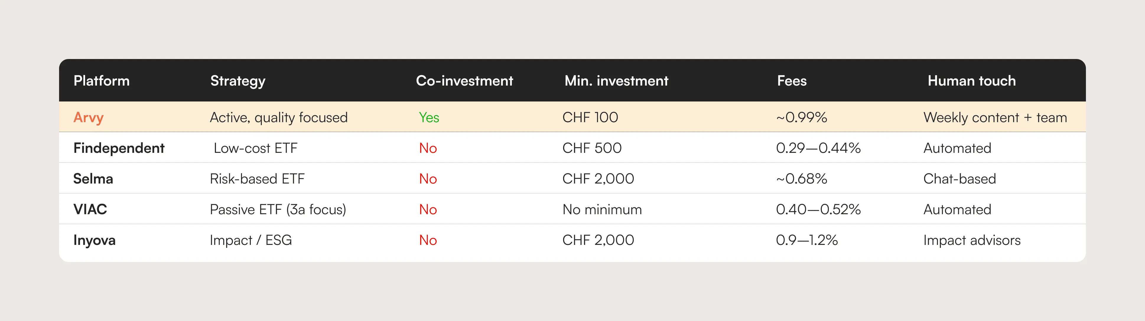
The Swiss fintech investment market is crowded, but almost entirely competed on price. Findependent, VIAC, Selma, Inyova: all of them lead with how cheap they are. arvy can't win that race and shouldn't try. At 0.99% all-in versus competitors at 0.29-0.68%, the only winning strategy is perceived value so that high price stops being the deciding factor.

The stakeholder interview made this clear: qualitative feedback already indicated users don't mind paying more if the perceived value adds up. The redesign's job was to make that value undeniable on the first visit.

The Swiss fintech investment market is crowded, but almost entirely competed on price. Findependent, VIAC, Selma, Inyova: all of them lead with how cheap they are. arvy can't win that race and shouldn't try. At 0.99% all-in versus competitors at 0.29-0.68%, the only winning strategy is perceived value so that high price stops being the deciding factor.

The stakeholder interview made this clear: qualitative feedback already indicated users don't mind paying more if the perceived value adds up. The redesign's job was to make that value undeniable on the first visit.

The Swiss fintech investment market is crowded, but almost entirely competed on price. Findependent, VIAC, Selma, Inyova: all of them lead with how cheap they are. arvy can't win that race and shouldn't try. At 0.99% all-in versus competitors at 0.29-0.68%, the only winning strategy is perceived value so that high price stops being the deciding factor.

The stakeholder interview made this clear: qualitative feedback already indicated users don't mind paying more if the perceived value adds up. The redesign's job was to make that value undeniable on the first visit.

What makes Arvy genuinely different

What makes Arvy genuinely different

  • Founders co-invest their own capital alongside clients, no competitor does this

  • Founders co-invest their own capital alongside clients, no competitor does this

  • Active, quality-focused portfolio of ~30 companies, not passive index ETFs

  • Active, quality-focused portfolio of ~30 companies, not passive index ETFs

  • Weekly educational content explaining what they own and why

  • Weekly educational content explaining what they own and why

  • CHF 100 minimum, lower than most Swiss competitors

  • CHF 100 minimum, lower than most Swiss competitors

  • FINMA regulated, CHF 50M+ under management within 6 months of launch
  • FINMA regulated, CHF 50M+ under management within 6 months of launch

Competitors landscape

Competitors landscape

Competitors landscape, Website redesign for arvy, Cro design

Audience

USER UNDERSTANDING

Designing for the investor who is curious but afraid to get it wrong

Designing for the investor who is curious but afraid to get it wrong

arvy targets a broad audience: young professionals, families, retirement savers, first-time investors, but the founding team identified one shared psychological barrier. Fear. Fear of doing something wrong, losing money, or being taken advantage of.

This isn't unique to arvy. It's a category-wide problem. And it means the user's first question isn't "what are the returns?" It's "can I trust this?" Trust had to be the design foundation.

arvy targets a broad audience: young professionals, families, retirement savers, first-time investors, but the founding team identified one shared psychological barrier. Fear. Fear of doing something wrong, losing money, or being taken advantage of.

This isn't unique to arvy. It's a category-wide problem. And it means the user's first question isn't "what are the returns?" It's "can I trust this?" Trust had to be the design foundation.

What users actually need from this site

  • Understand what arvy is in the first five seconds

  • Feel safe enough to take the next step

  • Find fee and minimum investment information without hunting for it

  • See social proof from real users, not just the founders

  • Have a clear, low-friction path to downloading the app or joining the newsletter

arvy's user personas

The curious beginner

Wants to start investing but doesn't know where. Needs clear language, no jargon, and a sense that this is designed for people like them.

The cautious researcher

Comparing platforms before committing. Needs fees, minimums, and differentiation surfaced clearly, without having to dig or ask the chatbot.

The content consumer

Not ready to invest yet but interested in arvy's weekly content. Needs a frictionless newsletter signup and a reason to keep coming back.

The persona challenge

The cautious researcher is the one the old site failed hardestm, they need proof, and proof was buried. Naming all three let me decide what each section had to do, and gave the secondary newsletter goal a clear owner instead of treating every visitor as a "would-be installer".


Serving three mindsets on one homepage meant nobody got a bespoke page. I prioritised the cautious researcher in the hero hierarchy because they're closest to the primary goal,an install, and let the beginner and content consumer be served further down. Designing for the install-ready visitor first kept the page from becoming a compromise that converted no one.

Conversion flow

INFORMATION ARCHITECTURE

Five user journeys, two conversion goals

Five user journeys, two conversion goals

The redesign needed to serve visitors with very different intentions, some ready to download, some researching fees, some just reading content… A single conversion funnel wouldn't work. The site needed to meet each user type at their point of entry and guide them toward one of two goals: app download or newsletter signup.

I mapped five distinct user journeys based on the stakeholder interview and chatbot data, then designed the information architecture to serve all five without creating confusion between them.

The redesign needed to serve visitors with very different intentions, some ready to download, some researching fees, some just reading content… A single conversion funnel wouldn't work. The site needed to meet each user type at their point of entry and guide them toward one of two goals: app download or newsletter signup.

I mapped five distinct user journeys based on the stakeholder interview and chatbot data, then designed the information architecture to serve all five without creating confusion between them.

(User journeys: 1.Download the application, 2.Sign up for the newsletter, 3.Learn more about the service/offer, 4. Learn about the fees, 5.Blog consumption)

(User journeys: 1.Download the application, 2.Sign up for the newsletter, 3.Learn more about the service/offer, 4. Learn about the fees, 5.Blog consumption)

(User journeys: 1.Download the application, 2.Sign up for the newsletter, 3.Learn more about the service/offer, 4. Learn about the fees, 5.Blog consumption)

Primary conversion funnel, Website redesign for arvy, Cro design

Primary conversion funnel

Primary conversion funnel

Primary conversion funnel

Iteration

DESIGN PROCESS

Building the right foundation before applying the visual layer

Building the right foundation before applying the visual layer

The process

The process

The process started with wireframes focused purely on information hierarchy and conversion flow, where does the co-investment story land, where do trust signals sit, how does the CTA appear at each scroll depth. Structure before style. From that foundation, the visual direction was developed: darker, more structured, typographically stronger, a premium feel that still carried the human warmth of the co-investment story.

The visual design phase brought its own iterations: layout details shifted as the design gained fidelity and the premium tone took shape. Structure informed style, and style refined structure.

The process started with wireframes focused purely on information hierarchy and conversion flow, where does the co-investment story land, where do trust signals sit, how does the CTA appear at each scroll depth. Structure before style. From that foundation, the visual direction was developed: darker, more structured, typographically stronger, a premium feel that still carried the human warmth of the co-investment story.

The visual design phase brought its own iterations: layout details shifted as the design gained fidelity and the premium tone took shape. Structure informed style, and style refined structure.

Wireframes, Website redesign for arvy, Cro design

Hero conversion

DESIGN . Homepage

Making the co-investment story hard to miss

Making the co-investment story hard to miss

Making the co-investment story hard to miss

What changed and why

What changed and why

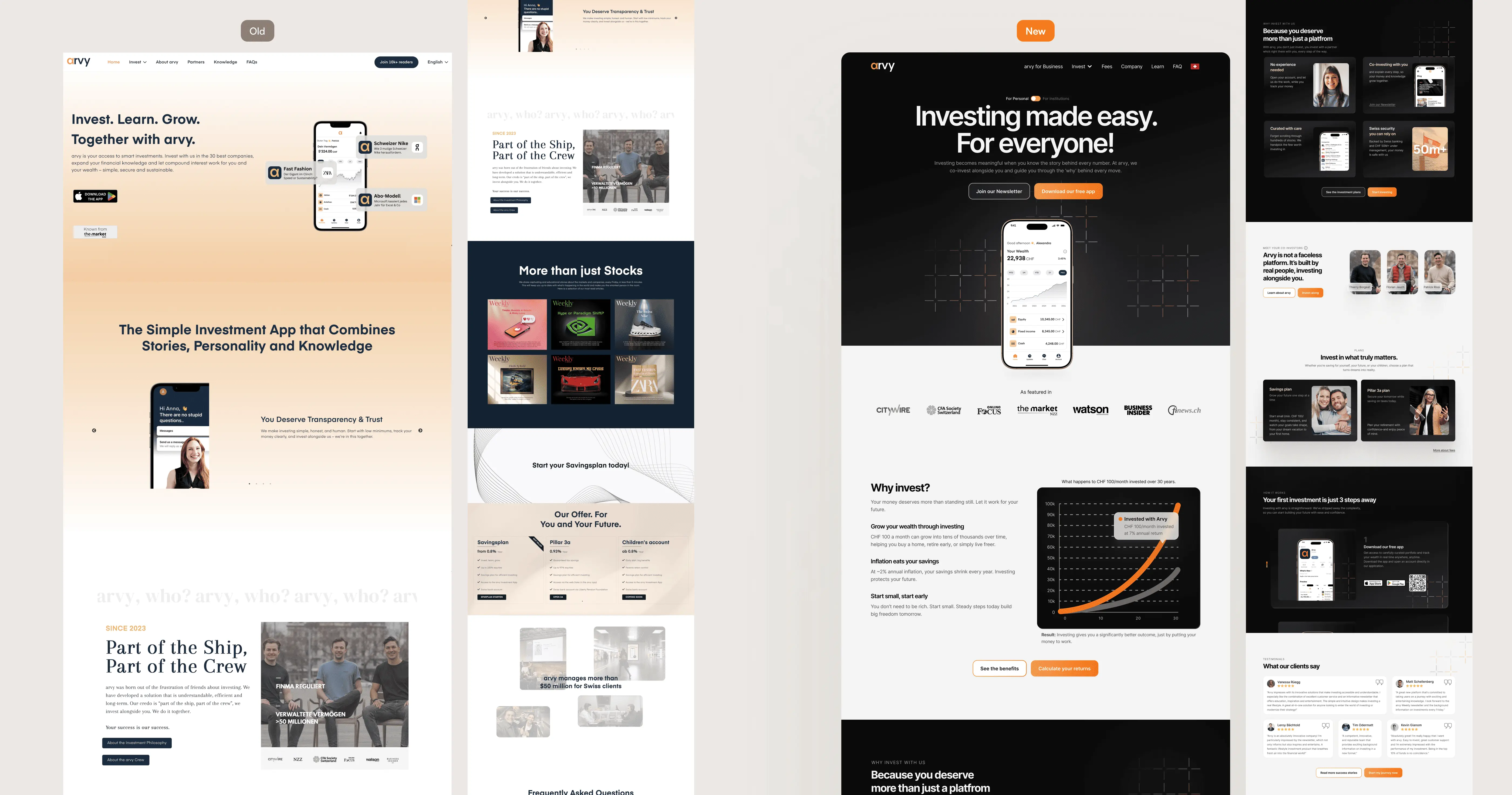
The old hero failed on three fronts: it didn't explain what arvy was, it didn't communicate who was behind it, and it didn't give users a clear first action. The new hero surfaces the co-investment model in the second sentence, and presents two clear CTAs , Download App as primary, Join Newsletter as secondary.

Below the fold, the "Why arvy" section replaces a generic feature list with a human-led narrative: experienced investors who left banking, investing alongside you, explaining what they own and why. This is the story that justifies the premium, and it needed to be told visually, not just in copy.
The old hero failed on three fronts: it didn't explain what arvy was, it didn't communicate who was behind it, and it didn't give users a clear first action. The new hero surfaces the co-investment model in the second sentence, and presents two clear CTAs , Download App as primary, Join Newsletter as secondary.


Below the fold, the "Why arvy" section replaces a generic feature list with a human-led narrative: experienced investors who left banking, investing alongside you, explaining what they own and why. This is the story that justifies the premium, and it needed to be told visually, not just in copy.

The old hero failed on three fronts: it didn't explain what arvy was, it didn't communicate who was behind it, and it didn't give users a clear first action. The new hero surfaces the co-investment model in the second sentence, and presents two clear CTAs , Download App as primary, Join Newsletter as secondary.


Below the fold, the "Why arvy" section replaces a generic feature list with a human-led narrative: experienced investors who left banking, investing alongside you, explaining what they own and why. This is the story that justifies the premium, and it needed to be told visually, not just in copy.

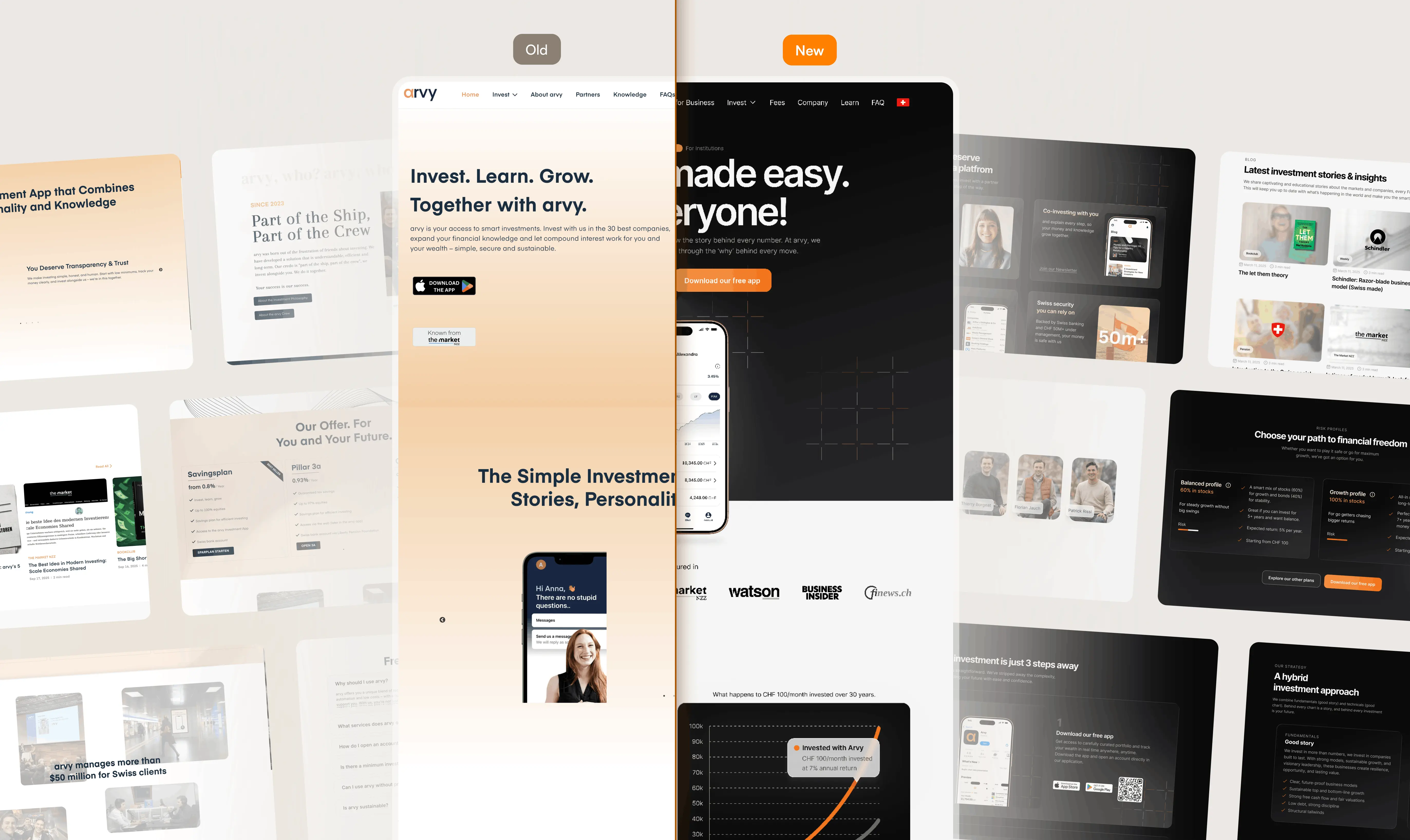
Before and After, Website redesign for arvy, Cro design

Newsletter growth

DESIGN . Content

Why content matters for conversion

Why content matters for conversion

arvy's weekly newsletter "Weekly by arvy" is both a product differentiator and a conversion step. Users who aren't ready to download the app can stay engaged through content, and content readers convert to app users at a much higher rate than cold visitors.

The Learn section was redesigned to serve this funnel: users arrive from social, read an article, encounter the newsletter signup in context, and either subscribe or download the app directly. The blog is the top of a second conversion path that runs parallel to the main download funnel.

arvy's weekly newsletter "Weekly by arvy" is both a product differentiator and a conversion step. Users who aren't ready to download the app can stay engaged through content, and content readers convert to app users at a much higher rate than cold visitors.


The Learn section was redesigned to serve this funnel: users arrive from social, read an article, encounter the newsletter signup in context, and either subscribe or download the app directly. The blog is the top of a second conversion path that runs parallel to the main download funnel.

arvy's weekly newsletter "Weekly by arvy" is both a product differentiator and a conversion step. Users who aren't ready to download the app can stay engaged through content, and content readers convert to app users at a much higher rate than cold visitors.


The Learn section was redesigned to serve this funnel: users arrive from social, read an article, encounter the newsletter signup in context, and either subscribe or download the app directly. The blog is the top of a second conversion path that runs parallel to the main download funnel.

Blog, Website redesign for arvy, Cro design

The CRO logic

a newsletter signup is a low-commitment yes. It keeps a not-yet-ready visitor in arvy's orbit until trust builds enough to install, turning content from a cost centre into the top of the funnel.

DESIGN . B2B side

A separate story for a different audience

A separate story for a different audience

Arvy operates two separate business lines. The B2C site, the primary focus of this redesign,targets individual app users. The B2B side serves institutional investors who access the arvy Equity Fund directly through their existing bank accounts.

These audiences have fundamentally different decision-making processes. Institutional investors aren't downloading an app, they're evaluating a fund for professional portfolios. The B2B section required its own entry point, its own messaging hierarchy, and its own trust architecture: Swiss roots, local presence, German-language communication, and professional track record.

Arvy operates two separate business lines. The B2C site, the primary focus of this redesign,targets individual app users. The B2B side serves institutional investors who access the arvy Equity Fund directly through their existing bank accounts.


These audiences have fundamentally different decision-making processes. Institutional investors aren't downloading an app, they're evaluating a fund for professional portfolios. The B2B section required its own entry point, its own messaging hierarchy, and its own trust architecture: Swiss roots, local presence, German-language communication, and professional track record.

B2B web design, Website redesign for arvy, Cro design

Trade off

Two entry points means more pages to design, maintain and keep consistent, real cost for a small team. I judged it worth it because a blended message would have under-served the higher-value B2B relationships to make the retail page slightly simpler. Protecting conversion on both audiences mattered more than minimising the page count.

FULL SITE DELIVERY
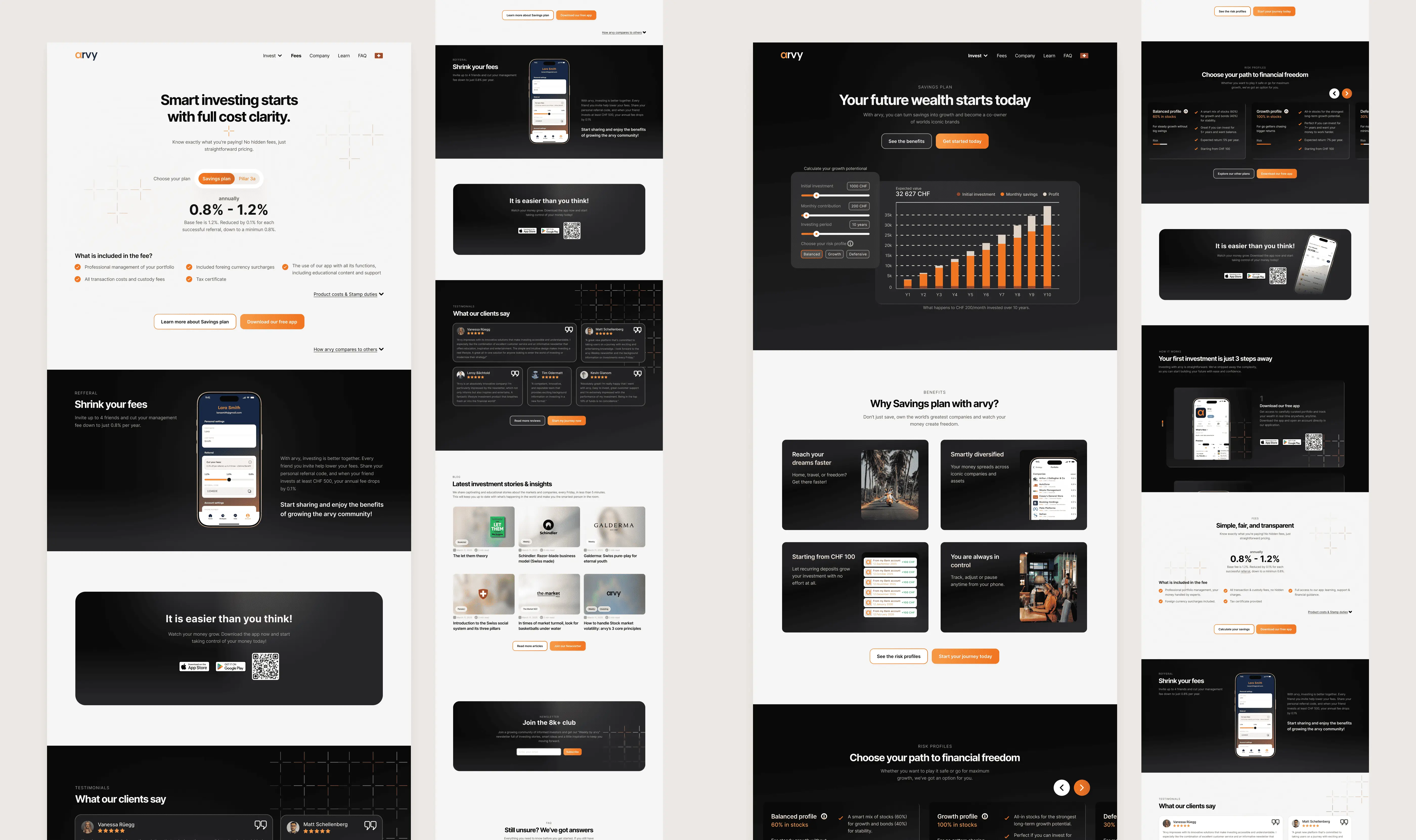
19 pages designed in total

19 pages designed in total

The redesign covered the full B2C website, homepage, all investment pages, investment calculator page, fees, company, learn, FAQ, Learn(blog) and the B2B institutional section, 404page,... Each page was designed with its own conversion goal and user type in mind and optimized for Desktop/Tablet/Phone.

The wallet shows total cashback, withdrawal options (bank transfer, Bizum, PayPal), and a progress indicator toward the €10 minimum. Before reaching the threshold, users receive notifications showing exactly how close they are, a progress mechanic that drives return visits.

A referral cashback overview is also surfaced here, giving users an additional engagement loop: earn more by sharing.

Website redesign for arvy, Cro design
Responsive design, Website redesign for arvy, Cro design

Key takeaways from redesigning a fintech website for trust

Key takeaways from redesigning a fintech website for trust

The chatbot is a UX audit waiting to be read

Five repeated questions told me exactly where the information architecture was failing. Every product has data like this, the trick is knowing to look for it and treating it as a design brief, not a support problem.

Five repeated questions told me exactly where the information architecture was failing. Every product has data like this, the trick is knowing to look for it and treating it as a design brief, not a support problem.

In fintech, trust is the conversion funnel

Users don't convert because the CTA is well-placed. They convert because by the time they reach the CTA, they've encountered enough trust signals to feel safe. Layering trust throughout the page is the work.

Users don't convert because the CTA is well-placed. They convert because by the time they reach the CTA, they've encountered enough trust signals to feel safe. Layering trust throughout the page is the work.

Premium positioning requires premium storytelling

arvy is priced higher than every direct competitor. The only way to justify that in a market obsessed with cheap is to make the story of why so compelling that price becomes secondary. That's a UX writing and hierarchy problem as much as a visual one.

arvy is priced higher than every direct competitor. The only way to justify that in a market obsessed with cheap is to make the story of why so compelling that price becomes secondary. That's a UX writing and hierarchy problem as much as a visual one.

Two audiences, one website, only works with a clear entry point split

Mixing B2C and B2B messaging on the same page would have diluted both. Separating the institutional audience into its own entry point let each section speak directly to its reader without compromise.

Mixing B2C and B2B messaging on the same page would have diluted both. Separating the institutional audience into its own entry point let each section speak directly to its reader without compromise.

LET'S WORK TOGETHER

If users can't understand your product in 5 seconds, they won't stick around for 6.

If users can't understand your product in 5 seconds, they won't stick around for 6.

The arvy redesign started with five chatbot questions nobody could find answers to on the site. That's where the conversion problem was hiding. Yours is hiding somewhere too, let's find it.

The arvy redesign started with five chatbot questions nobody could find answers to on the site. That's where the conversion problem was hiding. Yours is hiding somewhere too, let's find it.

THE IMPACT

THE IMPACT

Measured results, 6 months post-launch

+55%

Active users

Growth in active users in the 6 months following launch of the redesigned site.

+167%

User engagement

Engagement growth in Switzerland, arvy's core market, more than doubling post-launch.

~1.7%

App install click rate

From cold traffic, a strong signal for a regulated fintech product where trust is a prerequisite.

1.075

Newsletter sign-ups

First conversion baseline established, the secondary CTA goal,

*For finance/fintech websites broadly, average website conversion rate sits between 2-4%. Source clevertap.com

Analytics measurement is ongoing, the goal is to continue iterating based on real user behaviour as the data matures. One early finding has already surfaced: a bottleneck in the app's onboarding flow, pointing to the next area of focus for improving conversion end to end.

LET'S WORK TOGETHER

If users can't understand your product in 5 seconds, they won't stick around for 6.

The arvy redesign started with five chatbot questions nobody could find answers to on the site. That's where the conversion problem was hiding. Yours is hiding somewhere too, let's find it.