THE FULL CASE STUDY
How UX-driven feature design and a rebuilt design system reduced churn by 23% and accelerated product development at Candu, a product adoption platform for growth teams.
Industry:
Tech; No-code; Digital adoption platform
Scope:
Product design; Web design
Client:
Candu

THE IMPACT
Reduced user churn
New editor features directly addressed the friction points causing users to disengage.
Faster product development
Design system expansion & restructure, cut component duplication and aligned handoff across teams.
Higher user acquisition
A/B tested marketing site redesign improved conversion from visitor to trial signup.
CONTEXT
Candu is a product adoption platform built for growth and product teams who need to ship in-product experiences, onboarding flows, checklists, in-app announcements, growth experiments, and more, without touching the codebase. Its core is a drag-and-drop, no-code web editor/builder.
Candu was already live with active users when I joined which meant every design decision carried real stakes. I owned feature expansion, design system maintenance, and a full marketing site redesign, across a remote team in London and San Francisco.
FEATURE DESIGN . Editor
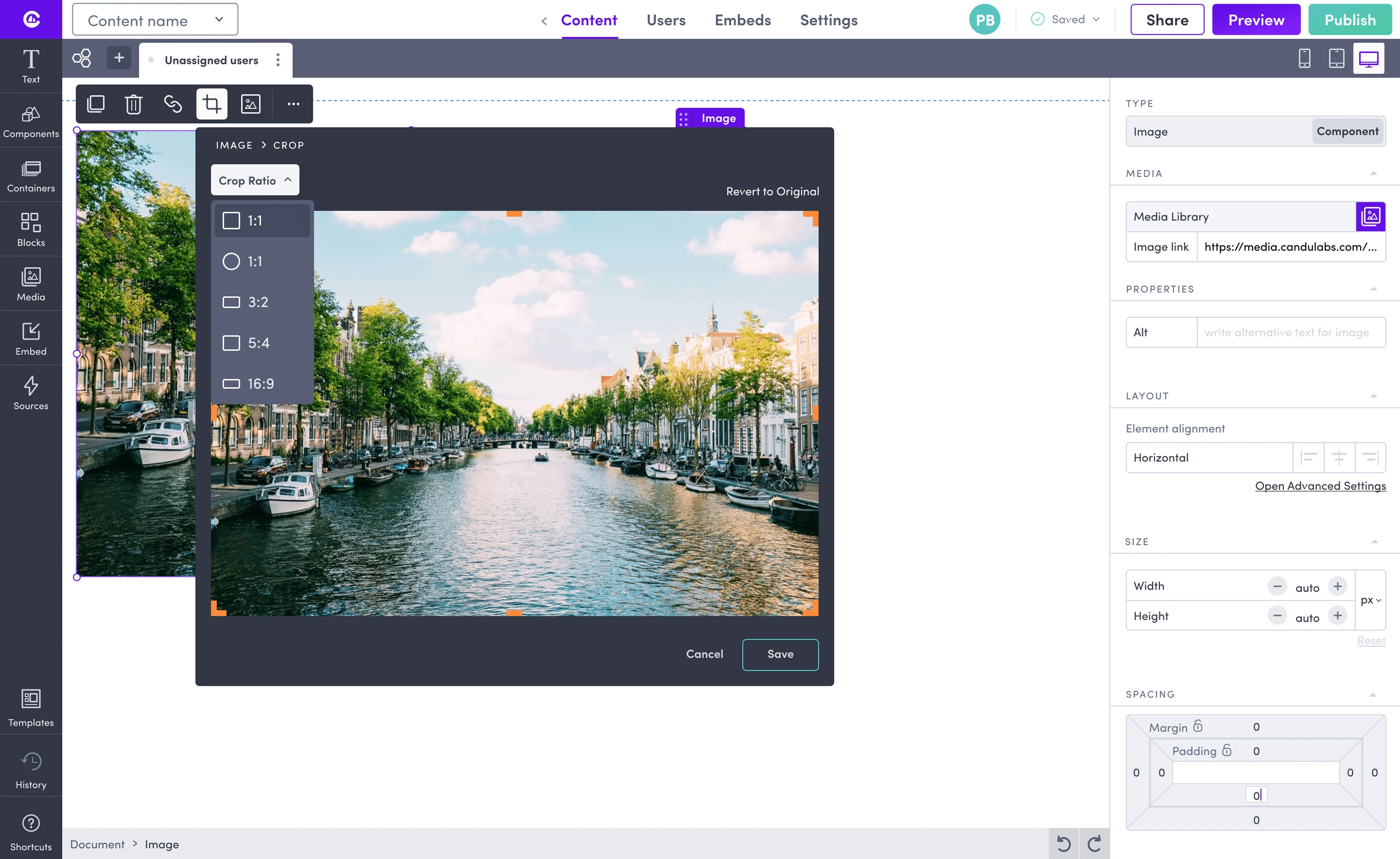
Users regularly uploaded images that didn't fit their layout. Without a native cropping tool, the only workaround was leaving Candu entirely, open external software, re-export, re-upload.
Every product exit mid-session is a retention risk.
This surfaced repeatedly in user feedback. It wasn't a feature request; it was a frustration signal.
Allow image adjustments without leaving the platform
Reduce decision load, make cropping feel effortless
Match industry-standard patterns so learning time is near-zero
Integrate naturally into the existing editor interaction model

FEATURE DESIGN . Editor
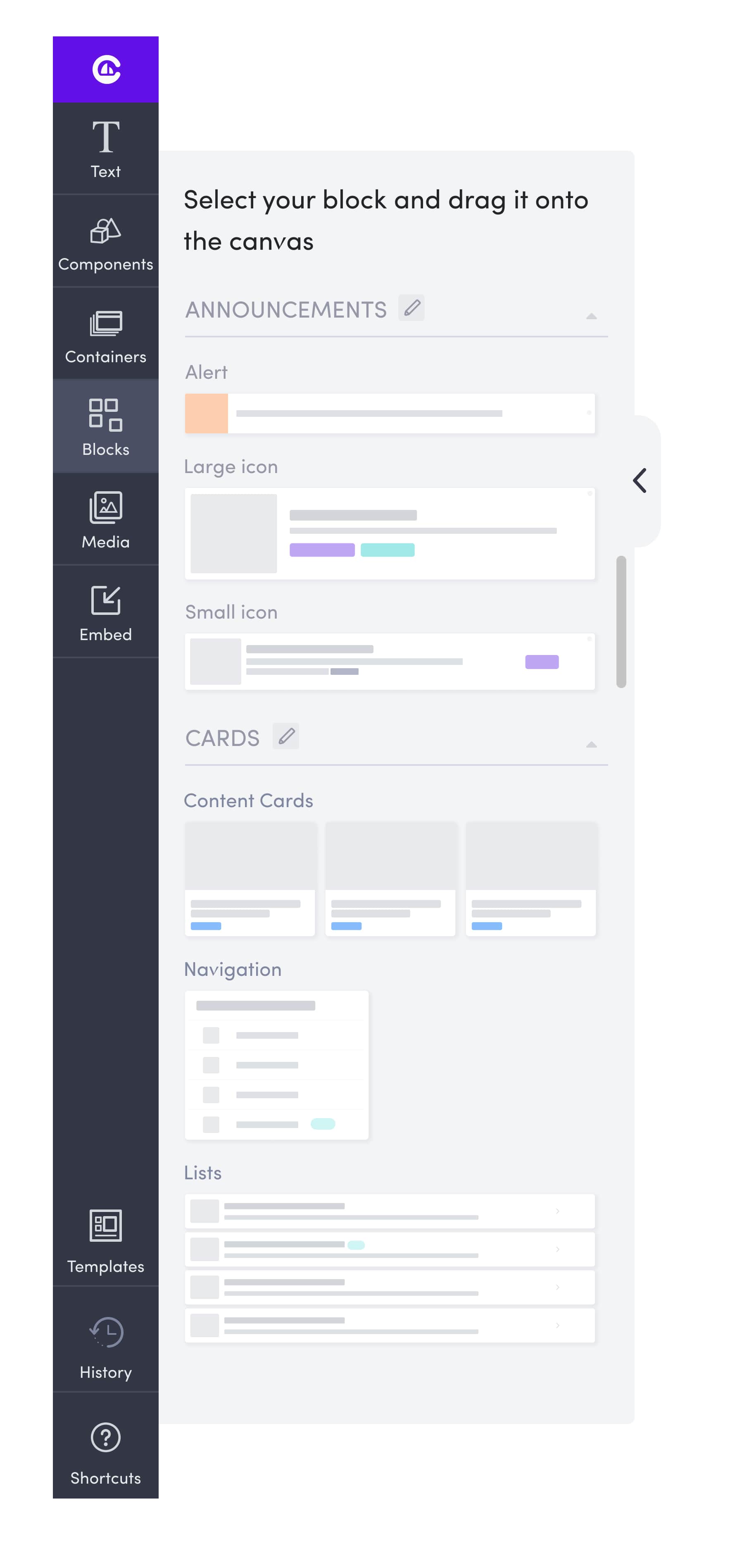
Candu's users aren't designers. They're product managers, growth leads, and customer success teams, people with strong goals and limited design bandwidth.
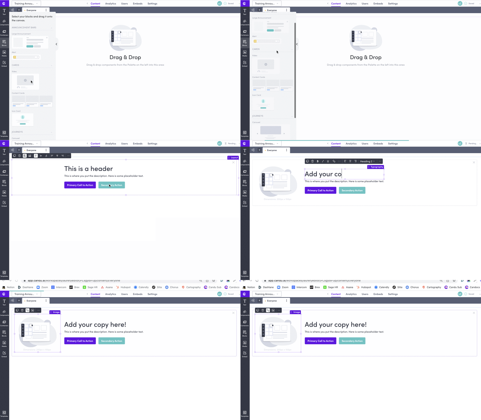
A blank canvas isn't empowering for them; it creates friction that delays time-to-first-publish.
And when users don't see value fast, churn risk spikes.
Shorten time-to-first-publish for new users
Drag-and-drop content blocks with sensible brand defaults
Full customisation: colors, fonts, spacing, images, copy
Maintain design integrity without requiring design skills
FEATURE DESIGN . Collaboration
Content created in Candu stayed inside Candu. Sharing for review meant exporting to external tools, losing context, and slowing down cross-functional feedback loops.
Beyond the UX friction, this was a growth constraint: individual users couldn't pull teammates in organically, limiting account expansion.
Shareable links: unique URL's for direct browser access
Email invitations with contextual notifications
Permission controls: view, edit, or comment roles
Password protection for sensitive content
Stakeholder preview page with inline commenting
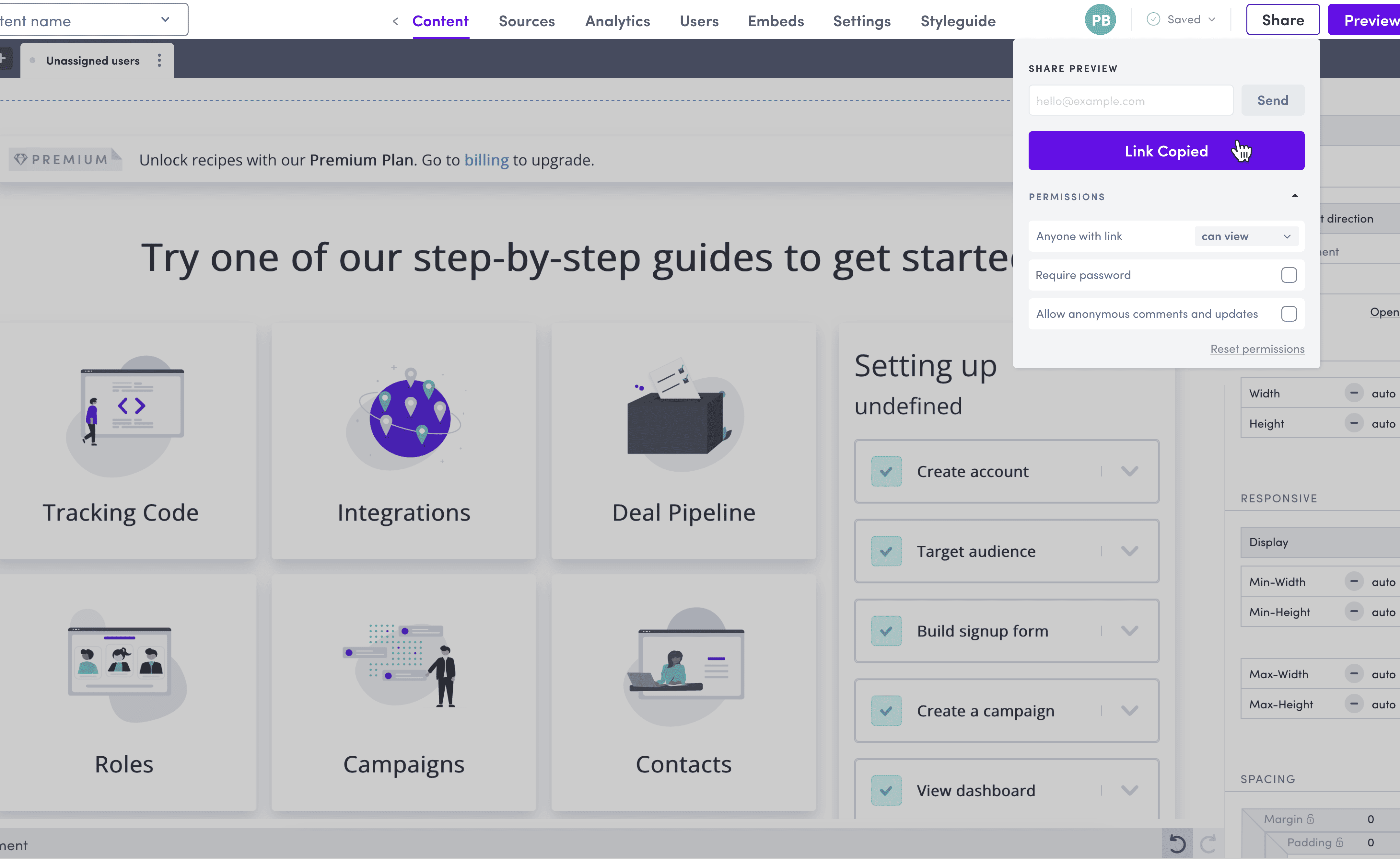
Link sharing: copy+paste

Password protection: optional for sensitive content

Email invitation: just 3 clicks away

FEATURE DESIGN . Onboarding
Getting Candu into a product requires a developer to install the SDK. For many users, this handoff to engineering is where momentum dies. A confusing or intimidating installation screen delays activation, and delayed activation increases the risk of users never fully committing to the product.
The goal was to reduce perceived complexity and make the path to "installed" feel achievable for both technical and non-technical users.
Reduce cognitive load at a high-drop-off moment
Give users a clear choice of installation method upfront
Make it easy to loop in a developer without leaving the product
Surface live installation status so users know when they're done


FEATURE DESIGN . Onboarding
New users needed to understand what the product could do for them, set it up, and reach their first meaningful moment, all before losing patience.
There's no single right answer to that problem, so we explored multiple onboarding approaches to find what actually moved users forward.


ENTERPRISE FEATURES
Designed the analytics dashboard for tracking visitor and event data across all content published through the editor. The challenge: surfacing actionable insight without overwhelming non-analytical users.
Clear hierarchy, progressive disclosure, and segment-level breakdowns, within the existing design system.
Designed MFA flows for both authenticator apps and SMS, including org-level deployment for admins. Security UX is notoriously friction-heavy.
The goal was to make MFA feel like a normal setup step, not a compliance obstacle that causes users to abandon the flow.

Analytics: visitor and event tracking

MFA: authenticator app, SMS
DESIGN SYSTEM
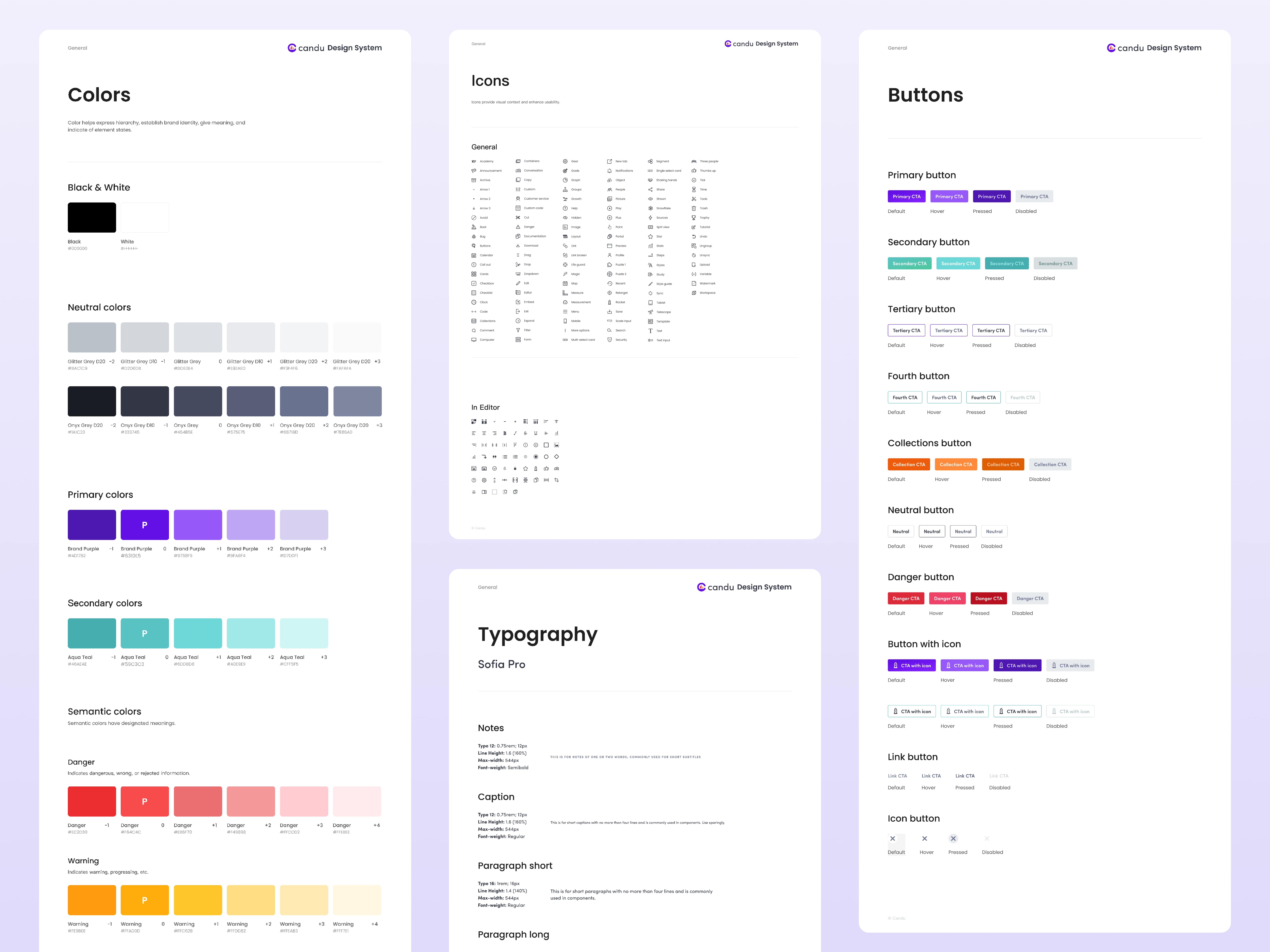
The original design system was built for a smaller, simpler product. As Candu scaled, the cracks showed: duplicated components, inconsistent patterns, and a library that slowed design rather than enabling it.
Inconsistency at the system level creates inconsistency in the product. And an inconsistent product erodes user trust, which eventually shows up in retention data and revenue.
Full audit of existing components, patterns, and docs
Retired duplicate and outdated components
Rebuilt token structure for scalable theming
Expanded library to cover new features
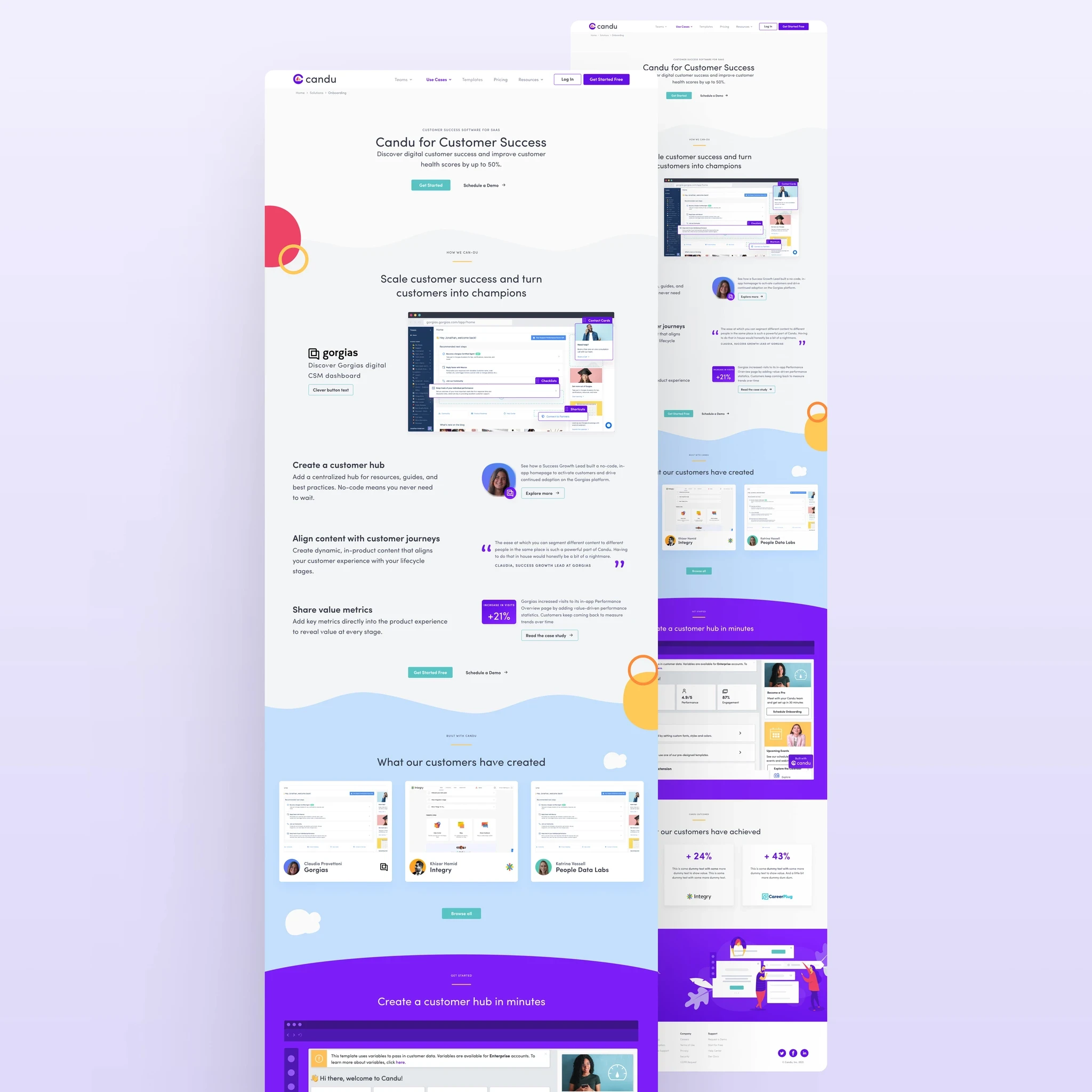
MARKETING SITE . Redesign
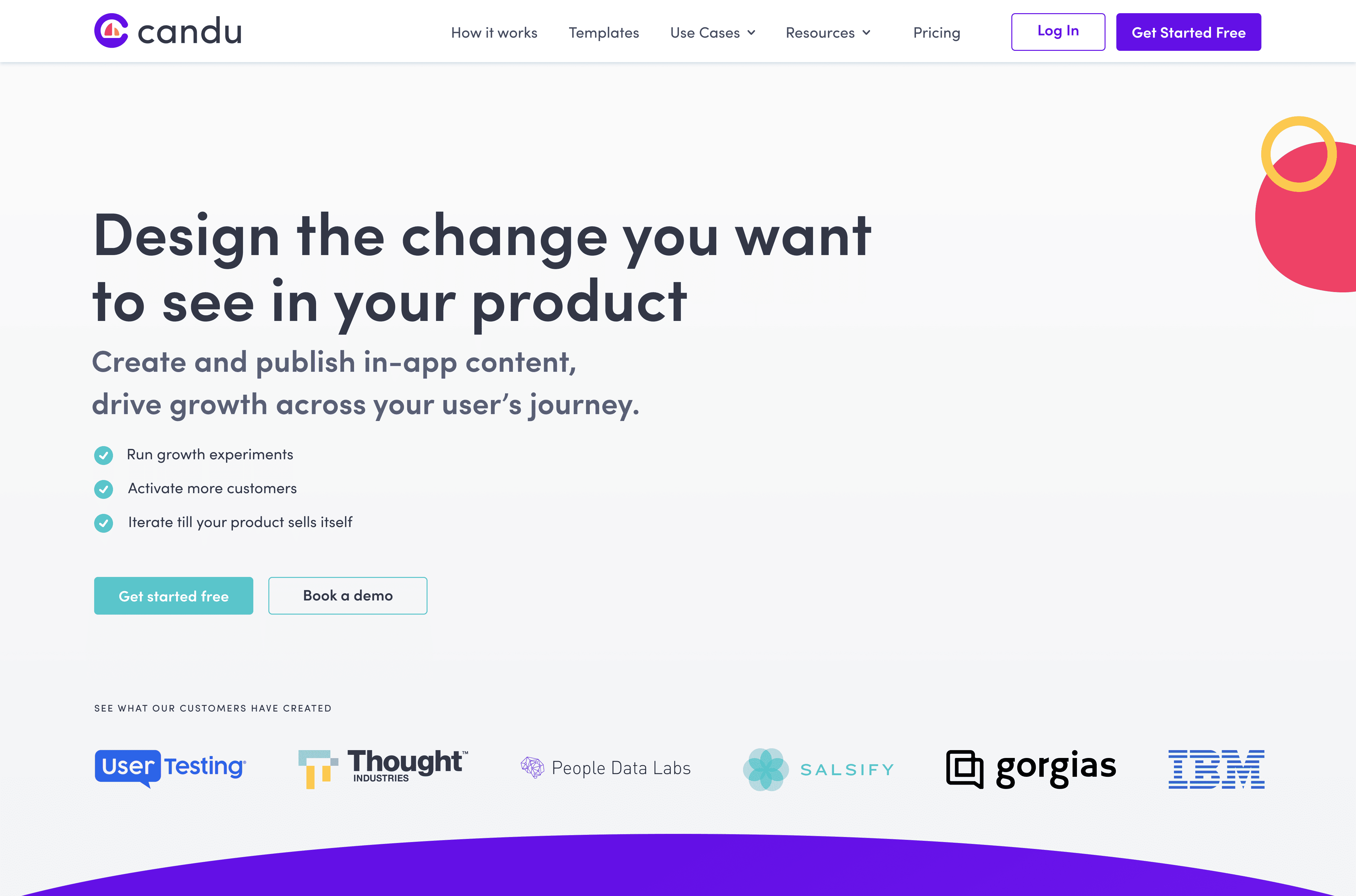
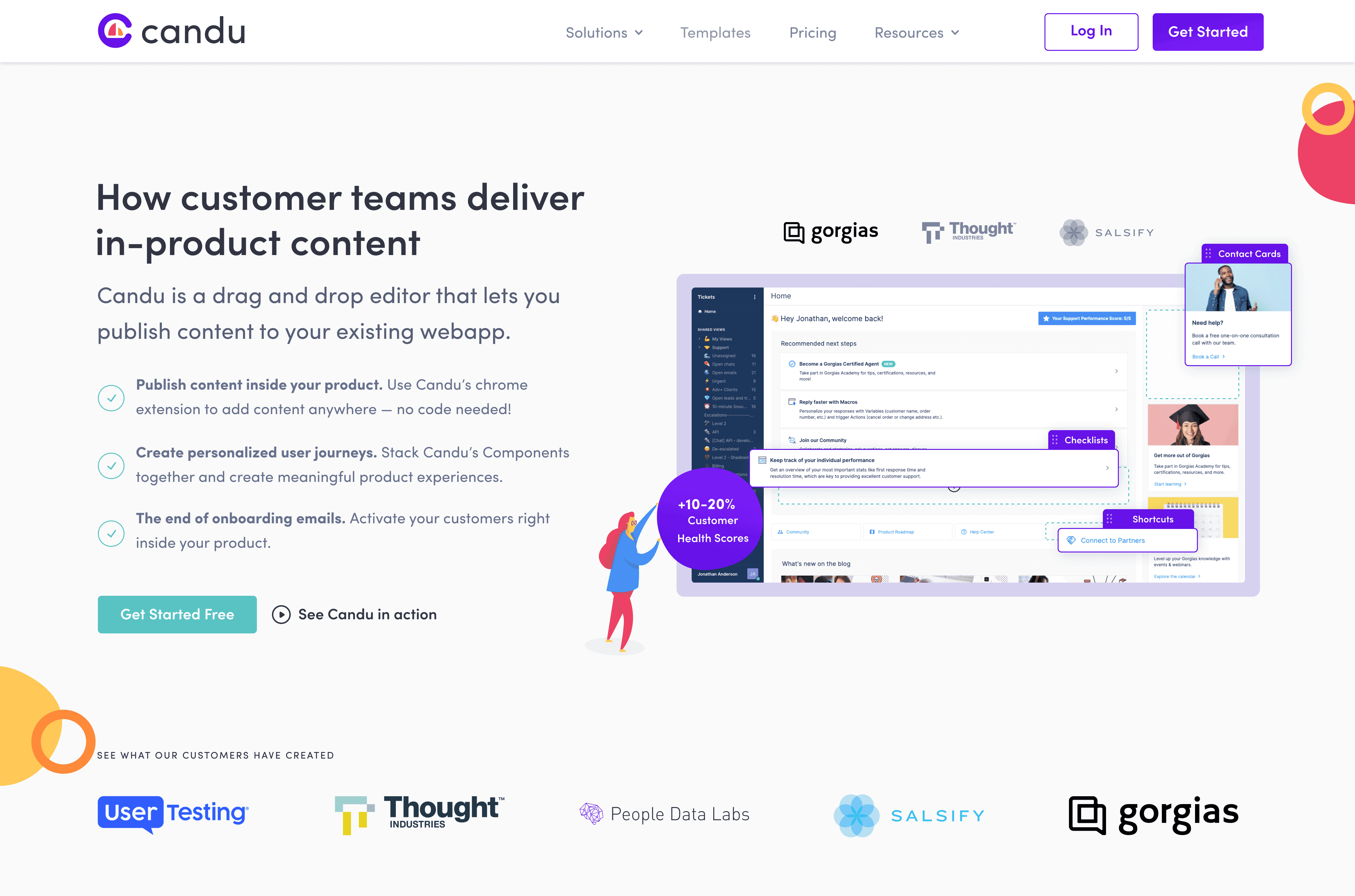
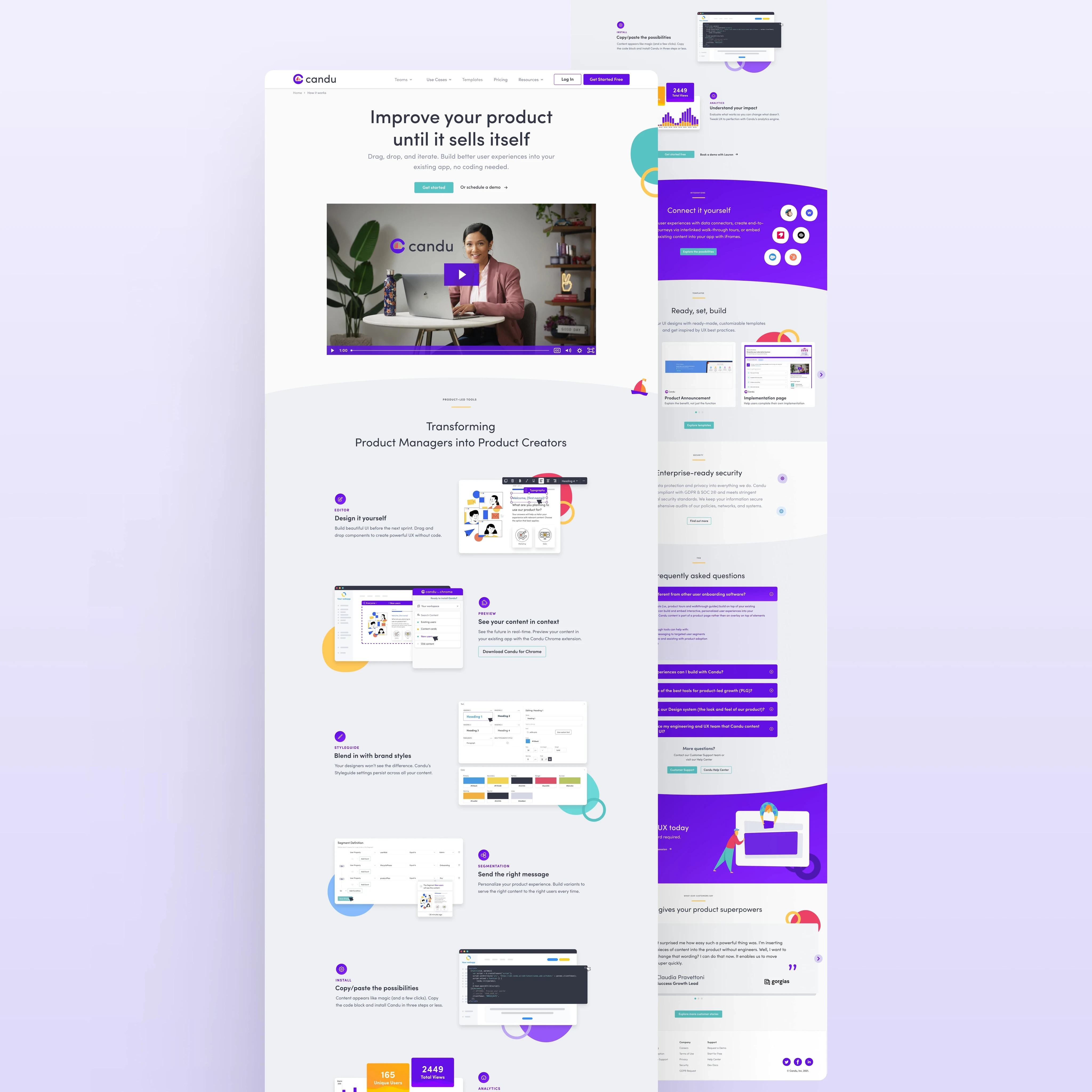
The existing site was product-focused in the wrong direction, it described features, not outcomes. As Candu's capabilities grew, the site failed to communicate its value proposition to the decision-makers most likely to convert: product leads and growth teams with limited time and high expectations.
The redesign needed to bridge the gap between what Candu does and why it matters to someone who controls the budget.
01

Feedback loops are a design signal, not just qualitative data
Image cropping and other features came directly from user feedback. Building a system to catch these signals early, and route them into the design process is as important as the design itself.
Design systems are a retention lever, not just a dev convenience
Inconsistency in the product creates subtle distrust. Investing in system coherence contributes to the user confidence that drives long-term retention and revenue.
Non-designer users need opinionated defaults
The Blocks feature taught me that empowerment doesn't mean maximum flexibility, it means reducing the burden of decisions that users shouldn't have to make.
The marketing site is the top of the retention funnel
Acquisition and retention aren't separate. A site that sets wrong expectations brings in users who will churn. A well-tested marketing site attracts the right users who stay.